Designing prepaid card disclosures
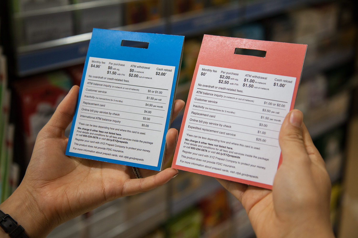
Comparison shopping with two proposed short-form disclosures for prepaid cards.
On November 13, 2014, the Consumer Financial Protection Bureau proposed new disclosures for prepaid accounts that will provide consumers with clear, upfront information about the associated costs and risks. These new disclosure requirements are part of our larger proposal to extend many federal consumer protections to prepaid products.
Prepaid accounts are typically loaded with funds by a consumer or by a third party, such as an employer. Consumers can use these products to make payments, store funds, get cash at ATMs, receive direct deposits, and send funds to other consumers. The amount of money consumers loaded onto general-purpose reloadable prepaid cards grew from less than $1 billion in 2003 to nearly $65 billion in 2012.
Currently, each prepaid card company’s retail package discloses different information in different ways. This can be confusing if you’re trying to compare costs between prepaid accounts. When the Bureau spoke with focus groups about prepaid cards, few participants reported doing any formal comparison shopping before purchasing a prepaid card in a retail store.
CFPB’s in-house design and user experience team spent the past year working with our colleagues in Research, Markets, and Regulations to design standardized model disclosure forms that would enable consumers to make more informed choices among prepaid options. We prepared designs and advised three rounds of usability testing, facilitated by ICF International, which informed the design that the Bureau proposed in its Notice of Proposed Rulemaking.
To reduce information overload on consumers in a retail setting, the proposed rule includes a short and long version of the proposed disclosure. The short-form disclosure would present consumers with a reduced, manageable set of fee and account information, while the proposed long-form disclosure would contain all of the fees and conditions that apply to the account.
In a retail store, the proposed short-form disclosure is designed to appear on the product’s external packaging and consumers would be able to access long-form disclosure information before acquiring the account by visiting a website on their mobile phone, or by calling a toll-free number.
We used a limited set of design tools in the proposed short-form disclosure to fit in a small space (3.5-inch square) similar to the industry’s current package design. Our aim is to improve the consumer shopping experience through a clear and simple layout, active language, and mobile-friendly access to the long-form disclosure. We designed the proposed disclosure with a single, easy-to-read typeface that is set at minimum font sizes to aid legibility. The proposed disclosure presents fees in two levels of hierarchy with what we believe to be clear, concise language. Horizontal lines are used to direct the eye and whitespace eases reading.
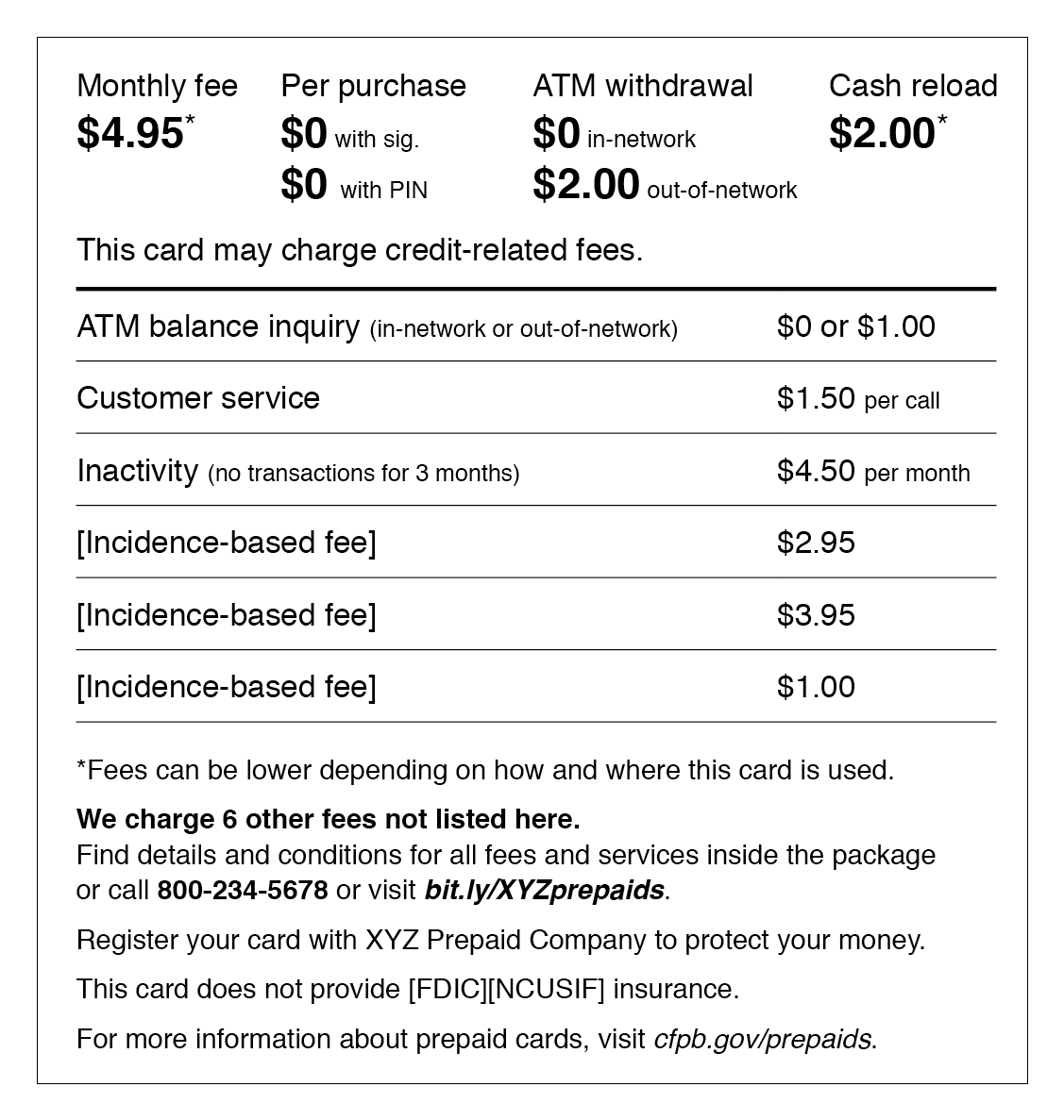
The proposed short-form disclosure design.
The results of CFPB’s usability testing informed many design choices on the proposed disclosure. Listed at the top of the proposed disclosure, in a larger, bold font, are the fees that testing participants identified as being most important to them when shopping for a prepaid account, and that Bureau staff identified as important through its market analysis.
In an earlier iteration of our design, we found that consumers struggled to interpret text that included slashes. For example, the design we proposed describes what we previously referred to as “in-network/out-of-network” as “in-network or out-of-network.”
For the same reason, asterisks and fine print appear sparingly. Early versions of the short-form disclosure design included many conditions for various fees in fine print. As we refined the design and incorporated consumers’ feedback, we decided to propose that financial institutions be required to disclose the highest fee possible, along with a single symbol indicating that the fee could be lower (if applicable). Consumers would be able to reference the long form for the details.
Because the short-form disclosure would not include all fees, we added to the proposal two elements to lessen the risk of hidden fees. First, we left space for a few additional fees that may vary from product to product. These fees represent those most frequently charged to consumers for that particular product. Second, the proposed disclosure would indicate the number of additional fees associated with that product, which, under the proposal, would all be included on the long-form disclosure. We think that this will give consumers a sense of control without feeling overwhelmed in a shopping environment.
We also identified a few suggested requirements that we believe will improve consumers’ in-store access to the electronic long-form disclosure. The proposed rule would require that the URL to the long-form disclosure be less than 22 characters and be meaningfully named. Under the proposal, the electronic long-form disclosure would have to be machine-readable so that consumers can read and retain it using the device that is best for them. In other words, it shouldn’t be presented as a static image.
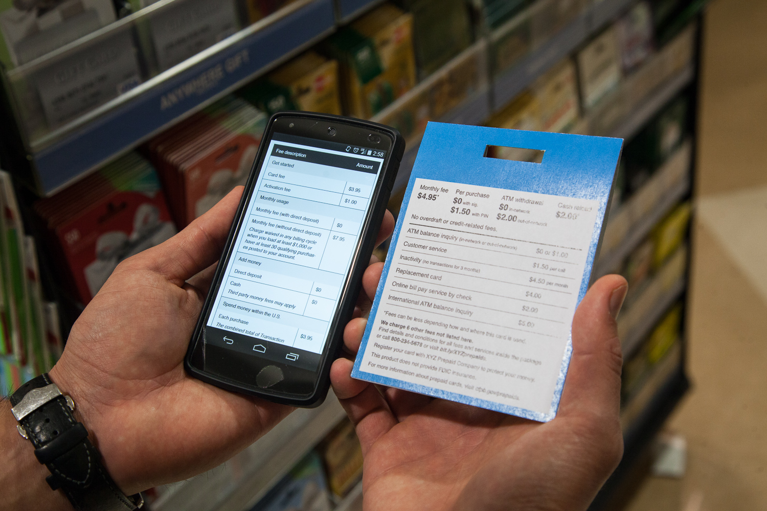
Reviewing the proposed electronic long form in the store with the proposed short-form disclosure.
Each member of the Bureau’s prepaid accounts team—lawyers, economists, project managers, researchers and designers—brought different strengths and experience to the project. Marrying that expertise with design best practices and technology standards greatly informed the rule-making process. In designing the solution the Bureau has proposed, it was a challenge to maintain a clear and simple visual hierarchy for so many competing pieces of information. We often asked ourselves, “Is this more important than that?” and reminded ourselves that if everything is emphasized, nothing is emphasized.
We hope that our role in designing these proposed disclosures will ultimately help improve the consumer’s experience when shopping for a prepaid card. Take a look, and tell us if you think the proposed design does a better job of disclosing fee information compared to fee information you’ve seen on prepaid card packaging. You can submit a comment until March 23, 2015. We look forward to seeing new disclosures in stores after any final rule is written and goes into effect!