Tables
Tables allow for the presentation of many data points grouped together in a visual way. They serve a unique purpose of allowing easy organization or comparison of more complex data than a chart or graph. They can be read either vertically (by columns) or horizontally (by rows).
Standard table
This is the default style at the large screen breakpoint. Tables are not responsive by default; see options below for responsive tables.
| Column 1 header | Column 2 header | Column 3 header |
|---|---|---|
| Row 1, column 1 | Row 1, column 2 | Row 1, column 3 |
| Row 2, column 1 | Row 2, column 2 | Row 2, column 3 |
| Row 3, column 1 | Row 3, column 2 | Row 3, column 3 |
HTML code snippet
<table>
    <caption>Table caption describing the data</caption>
    <thead>
        <tr>
            <th>Column 1 header</th>
            <th>Column 2 header</th>
            <th>Column 3 header</th>
        </tr>
    </thead>
    <tbody>
        <tr>
            <td>Row 1, column 1</td>
            <td>Row 1, column 2</td>
            <td>Row 1, column 3</td>
        </tr>
        <tr>
            <td>Row 2, column 1</td>
            <td>Row 2, column 2</td>
            <td>Row 2, column 3</td>
        </tr>
        <tr>
            <td>Row 3, column 1</td>
            <td>Row 3, column 2</td>
            <td>Row 3, column 3</td>
        </tr>
    </tbody>
</table>

<!--
Note: While th elements normally only contain raw text, they may sometimes contain heading elements when that would be beneficial to navigating a page’s content with a screenreader.
-->
Responsive tables
Responsive tables fall into two main types: stacked, which stacks information vertically on smaller screens, and scrolling, which ensures that all the information can be accessed in its original tabular structure, even on a smaller screen.
Note that tables are not responsive unless you add one of the small screen classes detailed below. Also note that the data-label attribute must be used to label each cell in a table for small screen responsive views. Responsive layouts are not applied to tables when pages are printed.
Responsive stacked table
To stack table information on smaller screens and make the information legible, use the .o-table--stack-on-small class.
| Column 1 | Column 2 | Column 3 |
|---|---|---|
| Row A | Cell A2 | Cell A3 |
| Row B | Cell B2 | Cell B3 |
| Row C | Cell C2 | Cell C3 |
| Row D | Cell D2 | Cell D3 |
HTML code snippet
<table class="o-table o-table--stack-on-small">
    <thead>
        <tr>
            <th>Column 1</th>
            <th>Column 2</th>
            <th>Column 3</th>
        </tr>
    </thead>
    <tbody>
        <tr>
            <td data-label="Column 1">Row A</td>
            <td data-label="Column 2">Cell A2</td>
            <td data-label="Column 3">Cell A3</td>
        </tr>
        <tr>
            <td data-label="Column 1">Row B</td>
            <td data-label="Column 2">Cell B2</td>
            <td data-label="Column 3">Cell B3</td>
        </tr>
        <tr>
            <td data-label="Column 1">Row C</td>
            <td data-label="Column 2">Cell C2</td>
            <td data-label="Column 3">Cell C3</td>
        </tr>
        <tr>
            <td data-label="Column 1">Row D</td>
            <td data-label="Column 2">Cell D2</td>
            <td data-label="Column 3">Cell D3</td>
        </tr>
    </tbody>
</table>
Responsive table with horizontal scroll
Use a table with horizontal scroll when the data you’re presenting has more columns than will fit comfortably on the screen, and you want to ensure all information can be accessed in its original tabular structure, even on smaller screens.
The .o-table--scrolling class must be added to the parent element of the table (by adding a wrapping div, in most cases). The table element does not need additional markup in this case. The “Comparative with horizontal scroll” style also adds striped rows to the table contained within, and remains striped on small screens (unlike the o-table–striped class, below).
| Column 1 | Column 2 | Column 3 | Column 4 | Column 5 | Column 6 | Column 7 | Column 8 |
|---|---|---|---|---|---|---|---|
| Row A | Cell A2 | Cell A3 | Cell A4 | Cell A5 | Cell A6 | Cell A7 | Cell A8 |
| Row B | Cell B2 | Cell B3 | Cell B4 | Cell B5 | Cell B6 | Cell B7 | Cell B8 |
| Row C | Cell C2 | Cell C3 | Cell C4 | Cell C5 | Cell C6 | Cell C7 | Cell C8 |
| Row D | Cell D2 | Cell D3 | Cell D4 | Cell D5 | Cell D6 | Cell D7 | Cell D8 |
HTML code snippet
<div class="o-table o-table--scrolling">
    <table>
        <thead>
            <tr>
                <th>Column 1</th>
                <th>Column 2</th>
                <th>Column 3</th>
                <th>Column 4</th>
                <th>Column 5</th>
                <th>Column 6</th>
                <th>Column 7</th>
                <th>Column 8</th>
            </tr>
        </thead>
        <tbody>
            <tr>
                <td data-label="Column 1">Row A</td>
                <td data-label="Column 2">Cell A2</td>
                <td data-label="Column 3">Cell A3</td>
                <td data-label="Column 4">Cell A4</td>
                <td data-label="Column 5">Cell A5</td>
                <td data-label="Column 6">Cell A6</td>
                <td data-label="Column 7">Cell A7</td>
                <td data-label="Column 8">Cell A8</td>
            </tr>
            <tr>
                <td data-label="Column 1">Row B</td>
                <td data-label="Column 2">Cell B2</td>
                <td data-label="Column 3">Cell B3</td>
                <td data-label="Column 4">Cell B4</td>
                <td data-label="Column 5">Cell B5</td>
                <td data-label="Column 6">Cell B6</td>
                <td data-label="Column 7">Cell B7</td>
                <td data-label="Column 8">Cell B8</td>
            </tr>
            <tr>
                <td data-label="Column 1">Row C</td>
                <td data-label="Column 2">Cell C2</td>
                <td data-label="Column 3">Cell C3</td>
                <td data-label="Column 4">Cell C4</td>
                <td data-label="Column 5">Cell C5</td>
                <td data-label="Column 6">Cell C6</td>
                <td data-label="Column 7">Cell C7</td>
                <td data-label="Column 8">Cell C8</td>
            </tr>
            <tr>
                <td data-label="Column 1">Row D</td>
                <td data-label="Column 2">Cell D2</td>
                <td data-label="Column 3">Cell D3</td>
                <td data-label="Column 4">Cell D4</td>
                <td data-label="Column 5">Cell D5</td>
                <td data-label="Column 6">Cell D6</td>
                <td data-label="Column 7">Cell D7</td>
                <td data-label="Column 8">Cell D8</td>
            </tr>
        </tbody>
    </table>
</div>
Variations
Striped table
Striping is useful to help the eye track across table rows. Use striping for tables that have more than five columns, or for tables with rows that are difficult to follow across the full width of the table.
The .o-table--striped class adds stripes to the table rows. This striping is not visible on small screens.
| Column 1 | Column 2 | Column 3 |
|---|---|---|
| Row A | Cell A2 | Cell A3 |
| Row B | Cell B2 | Cell B3 |
| Row C | Cell C2 | Cell C3 |
| Row D | Cell D2 | Cell D3 |
HTML code snippet
<table class="o-table o-table--striped">
    <thead>
        <tr>
            <th>Column 1</th>
            <th>Column 2</th>
            <th>Column 3</th>
        </tr>
    </thead>
    <tbody>
        <tr>
            <td data-label="Column 1">Row A</td>
            <td data-label="Column 2">Cell A2</td>
            <td data-label="Column 3">Cell A3</td>
        </tr>
        <tr>
            <td data-label="Column 1">Row B</td>
            <td data-label="Column 2">Cell B2</td>
            <td data-label="Column 3">Cell B3</td>
        </tr>
        <tr>
            <td data-label="Column 1">Row C</td>
            <td data-label="Column 2">Cell C2</td>
            <td data-label="Column 3">Cell C3</td>
        </tr>
        <tr>
            <td data-label="Column 1">Row D</td>
            <td data-label="Column 2">Cell D2</td>
            <td data-label="Column 3">Cell D3</td>
        </tr>
    </tbody>
</table>
Right-aligned table
Right-align columns of numbers when they’re quantities (counts, dollar amounts, percentages) or ordinals (ranks, item numbers). Use the .o-table__cell--right-align class on a td.
Left-align columns of numbers when they’re nominal (ZIP codes, room numbers) or non-numeric values (names, phrases).
| Column 1 | Column 2 | Right-aligned column |
|---|---|---|
| Row A | Cell A2 | $1.00 |
| Row B | Cell B2 | $200.02 |
HTML code snippet
<table class="o-table o-table--stack-on-small">
    <thead>
        <tr>
            <th>Column 1</th>
            <th>Column 2</th>
            <th  class="o-table__cell--right-align">Right-aligned column</th>
        </tr>
    </thead>
    <tbody>
        <tr>
            <td data-label="Column 1">Row A</td>
            <td data-label="Column 2">Cell A2</td>
            <td data-label="Right-aligned column" class="o-table__cell--right-align">$1.00</td>
        </tr>
        <tr>
            <td data-label="Column 1">Row B</td>
            <td data-label="Column 2">Cell B2</td>
            <td data-label="Right-aligned column" class="o-table__cell--right-align">$200.02</td>
        </tr>
    </tbody>
</table>HTML code snippet
<table class="o-table">
    <thead>
        <tr>
            <th>Column 1</th>
            <th>Column 2</th>
            <th>Column 3</th>
        </tr>
    </thead>
    <tbody>
        <tr>
            <td data-label="Column 1">
                <a href="https://example.com/">Example 1</a>
            </td>
            <td data-label="Column 2">Cell A2</td>
            <td data-label="Column 3" >Cell A3</td>
        </tr>
        <tr>
            <td data-label="Column 1">
                <a href="https://example.com/">Example 2</a>
            </td>
            <td data-label="Column 2">Cell B2</td>
            <td data-label="Column 3">Cell B3</td>
        </tr>
    </tbody>
</table>
Pagination
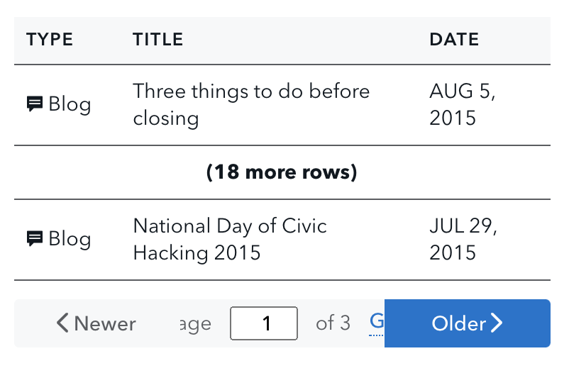
Tables with over 20 rows can be paired with pagination.
HTML code snippet
<!--Code from Design Manual
<table class="o-table o-table--stack-on-small">
    <thead>
        <tr>
            <th class="u-w20pct">
                Type
            </th>
            <th class="u-w55pct">
                Title
            </th>
            <th class="u-w25pct">
                Date
            </th>
        </tr>
    </thead>
    <tbody>
        <tr>
            <td data-label="Type">
                <svg xmlns="http://www.w3.org/2000/svg" class="cf-icon-svg cf-icon-svg--speech-bubble" viewBox="0 0 15 19"><path d="M14.032 5.286v7.276a1.112 1.112 0 0 1-1.108 1.108h-.792v1.762c0 .262-.182.362-.403.224L8.546 13.67h-6.47a1.112 1.112 0 0 1-1.108-1.108V5.286a1.112 1.112 0 0 1 1.108-1.108h10.848a1.112 1.112 0 0 1 1.108 1.108zm-1.9 1.677H2.868V8.07h9.264zm0 2.843H2.868v1.108h9.264z"/></svg> Blog
            </td>
            <td data-label="Title">
                Three things to do before closing
            </td>
            <td data-label="Date">
                AUG 5, 2015
            </td>
        </tr>
        <tr>
            <td data-label="Type">
                <svg xmlns="http://www.w3.org/2000/svg" class="cf-icon-svg cf-icon-svg--speech-bubble" viewBox="0 0 15 19"><path d="M14.032 5.286v7.276a1.112 1.112 0 0 1-1.108 1.108h-.792v1.762c0 .262-.182.362-.403.224L8.546 13.67h-6.47a1.112 1.112 0 0 1-1.108-1.108V5.286a1.112 1.112 0 0 1 1.108-1.108h10.848a1.112 1.112 0 0 1 1.108 1.108zm-1.9 1.677H2.868V8.07h9.264zm0 2.843H2.868v1.108h9.264z"/></svg> News
            </td>
            <td data-label="Title">
                Electronic Mortgage Closings Can Benefit Consumers
            </td>
            <td data-label="Date">
                AUG 5, 2015
            </td>
        </tr>
    <tr>
            <td colspan="3" style="text-align: center; font-weight: bold;">
                (18 more rows)
            </td>
        </tr>
        <tr>
            <td data-label="Type">
                <svg xmlns="http://www.w3.org/2000/svg" class="cf-icon-svg cf-icon-svg--speech-bubble" viewBox="0 0 15 19"><path d="M14.032 5.286v7.276a1.112 1.112 0 0 1-1.108 1.108h-.792v1.762c0 .262-.182.362-.403.224L8.546 13.67h-6.47a1.112 1.112 0 0 1-1.108-1.108V5.286a1.112 1.112 0 0 1 1.108-1.108h10.848a1.112 1.112 0 0 1 1.108 1.108zm-1.9 1.677H2.868V8.07h9.264zm0 2.843H2.868v1.108h9.264z"/></svg> Blog
            </td>
            <td data-label="Title">
                National Day of Civic Hacking 2015
            </td>
            <td data-label="Date">
                JUL 29, 2015
            </td>
        </tr>
    </tbody>
</table>

<nav class="m-pagination" role="navigation" aria-label="Pagination">
    <a class="a-btn
              a-btn--disabled
              m-pagination__btn-prev">
        <svg xmlns="http://www.w3.org/2000/svg" class="cf-icon-svg cf-icon-svg--left" viewBox="0 0 10 19"><path d="M8.4 17.269a1.026 1.026 0 0 1-.727-.302l-6.801-6.8a1.03 1.03 0 0 1 0-1.456l6.8-6.8a1.03 1.03 0 0 1 1.456 1.455L3.055 9.439l6.073 6.073A1.03 1.03 0 0 1 8.4 17.27z"/></svg>
        Newer
    </a>

    <a class="a-btn
              m-pagination__btn-next" href="#">
        Older
        <svg xmlns="http://www.w3.org/2000/svg" class="cf-icon-svg cf-icon-svg--right" viewBox="0 0 10 19"><path d="M1.6 17.262a1.03 1.03 0 0 1-.728-1.757l6.073-6.073L.872 3.36a1.03 1.03 0 0 1 1.455-1.455l6.8 6.8a1.03 1.03 0 0 1 0 1.456l-6.8 6.8a1.025 1.025 0 0 1-.727.302z"/></svg>
    </a>
    <form class="m-pagination__form" action="#">
        <label class="m-pagination__label" for="m-pagination__current-page">
            Page
            <span class="u-visually-hidden">
                number out of 3 total pages
            </span>
            <input class="m-pagination__current-page" id="m-pagination__current-page" name="page" type="number" min="1" max="3" inputmode="numeric" value="1">
            of 3
        </label>
        <button class="a-btn
                       a-btn--link
                       m-pagination_submit-btn" id="pagination_submit" type="submit">Go</button>
    </form>
</nav>
-->
Fixed-width column tables
Column widths are automatically set by browsers by default. If needed, some or all columns can be set to specific widths instead to accommodate longer data or labels.
Fixed-width columns at the 600 px breakpoint and less lose their custom widths and expand to full width. This is the same responsive pattern used for default tables at small screens.
| County | Lien status | Active? |
|---|---|---|
| Abbeville | Secured | Yes |
| Abbey | Secured | No |
HTML code snippet
<table class="o-table o-table--stack-on-small">
    <thead>
        <tr>
            <th class="u-w20pct">
                County
            </th>
            <th class="u-w60pct">
                Lien status
            </th>
            <th class="u-w20pct">
                Active?
            </th>
        </tr>
    </thead>
    <tbody>
        <tr>
            <td data-label="County">
                Abbeville
            </td>
            <td data-label="Lien status">
                Secured
            </td>
            <td data-label="Active?">
                Yes
            </td>
        </tr>
        <tr>
            <td data-label="County">
                Abbey
            </td>
            <td data-label="Lien status">
                Secured
            </td>
            <td data-label="Active?">
                No
            </td>
        </tr>
    </tbody>
</table>
Use cases
Tables allow easy organization or comparison of more complex data than a chart or graph. They can be read either vertically (by columns) or horizontally (by rows).
Tables work best when:
- Presenting sequential data
- Data being presented requires specific or precise values
- Individual values are being presented or compared
- Values across columns or rows require different units of measurement
Guidelines
As a rule, design tables so that they are easy to read. Label columns precisely and include units of measurement where necessary. Organize the data so that the underlying meaning is quickly apparent.
Labels and titles
Give tables a meaningful title that succinctly describes the content presented so that users can understand their purpose at a glance. If presenting more than one table within a page, consider adding labels (e.g. “Table 1,” “Table 2,” etc.) in addition to titles. Labels should precede titles (e.g. “Table 1: The title given to this table”).
Long column labels
Consider using fixed columns or truncation for column labels that are significantly longer than the expected width of the data.
Unit of measurement
Make sure to indicate the unit of measurement. In terms of placement, if the units are the same across columns, indicate the unit of measurement in the title or someplace noticeable above the table.
Alternatively, if the table uses at most two units of measurement, consider using asterisks following the column label, and define the unit of measurement below the table.
If units differ from column to column, the standard is to list the unit of measure in parentheses following the column label. Make sure to use common abbreviations when indicating units of measure. Spell out any ambiguous or obscure abbreviations.
Accessibility
Remember to always use headers (that is, <th> elements) for all data tables to make tabular data accessible.