Main content
Info unit groups
Info unit groups are used to draw a user’s eye to key information on a page. An info unit can contain an image, brief description, and call-to-action link to lead a user to additional content on a child or sibling page.
Types
25/75 info unit

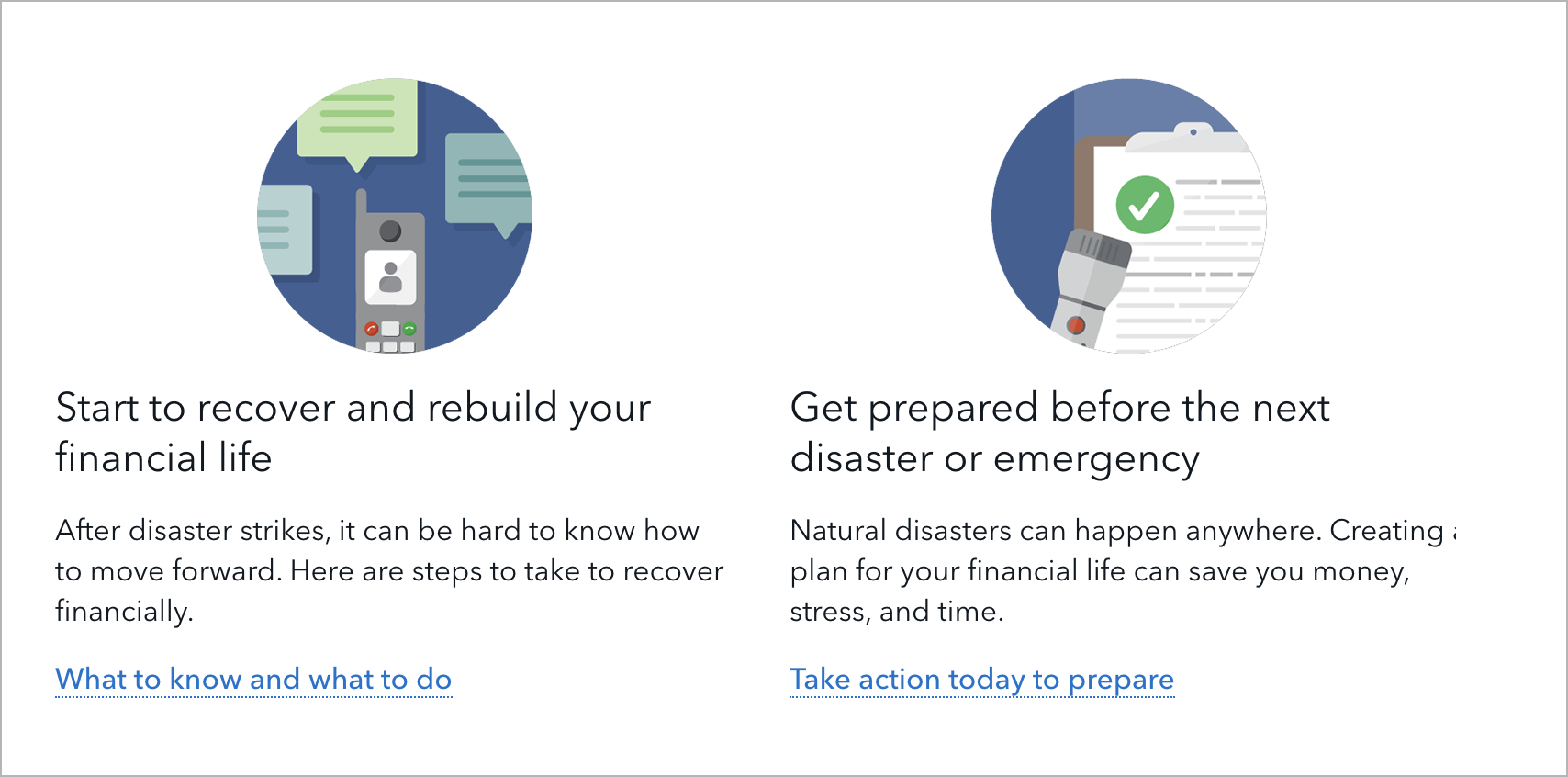
50/50 info unit
Jinja code snippet
File in https://github.com/cfpb/consumerfinance.gov:

https://github.com/cfpb/consumerfinance.gov/blob/e67d1ad321551c221c01eaa62589dfdd1177d1dc/cfgov/jinja2/v1/_includes/organisms/half-width-link-blob-group.html
33/33/33 info unit
Jinja code snippet
File in https://github.com/cfpb/consumerfinance.gov:

https://github.com/cfpb/consumerfinance.gov/blob/e67d1ad321551c221c01eaa62589dfdd1177d1dc/cfgov/jinja2/v1/_includes/organisms/third-width-link-blob-group.html
Use cases
When to use
- To visually call out succinct information and a call-to-action link that leads users to a deeper dive into content
- To help establish a hierarchy of linked content on a page
When other options are better
- When presenting multiple paragraphs of content
Guidelines
Content guidelines
- Content in info units should be succinct. Do not use info units for multiple paragraphs of copy.
- In addition to giving each info unit a heading and description, you may optionally give the info unit group a heading and introductory paragraph.
- Each info unit type may use an H2, H3, or H4 depending on where the info unit sits within the page’s heading hierarchy.
25/75 info unit
- Heading: Maximum 60 characters
- Description: Maximum 275 characters
- Call to action: Maximum 65 characters
50/50 info unit
Ideally, use an even number of 50/50 info units as a group. The content in each info unit should be roughly the same number of lines if possible.
- Heading: Maximum 30 characters
-
Description
- If including an image, minimum 50 characters and maximum 130 characters
- If not including an image, minimum 100 characters and maximum 250 characters
- Call to action: Maximum 40 characters
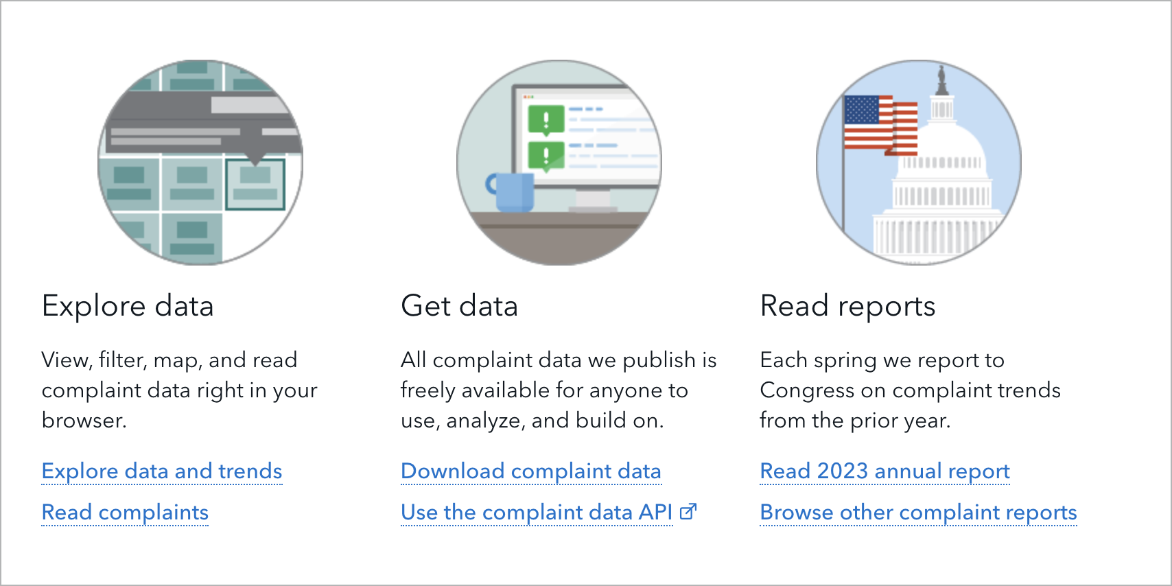
33/33/33 info unit
Ideally, group 33/33/33 info units in multiples of three. The content in each info unit should be roughly the same number of lines if possible.
- Heading: Maximum 30 characters
- Description: Minimum 90 characters and maximum 150 characters
- Call to action: Maximum 30 characters
Image guidelines
Images can be illustrations or photos.
25/75 info unit
- Image required
-
1:1 ratio size
- Export the image at a 300px width to display well on retina screens. It will appear as 150px wide at a large browser width and automatically resize to 130px wide at a small browser width.
- Can be a square or circle crop
50/50 info unit
- Image optional
-
16:9 or 1:1 ratio size
- For 16:9, export the image at a 1076px width by 606px height to display well on retina screens. It will appear at a 538px width by 303px height.
- For 1:1, export the image at a 300px width to display well on retina screens. It will appear as 150px wide at a large browser width and automatically resize to 130px wide at a small browser width. The image can be a square or circle crop.
33/33/33 info unit
- Image optional
-
1:1 ratio size
- Export the image at a 300px width to display well on retina screens. It will appear as 150px wide at a large browser width and automatically resize to 130px wide at a small browser width.
- Can be a square or circle crop
Stylistic guidelines
- Option to include a rule above an info unit group to separate it from the previous section on the page
- Option to include a rule between rows of info units (or between each info unit in the case of the 25/75 info unit)
- If an info unit group contains both an image and a call-to-action link, option to make the image link to the call-to-action URL. If there are multiple call-to-action links, the image will link to the first link.
Behavior
All info units stack to one column at small screen size.