Illustrations
Illustrations are an important tool for introducing the subject matter of a page, event, or topic. Illustrations are vector-based graphics that support primary headers and text. They function as the brand’s top-level illustration style with detail and clarity. Illustration is universally relatable and accessible to all audiences. The content of an illustration should always be politically and socially neutral.

Consumer illustrations
Consumer illustrations are universally relatable and set a friendly tone when communicating complex topics.
The color palette should use the full range of primary and secondary colors, but selectively use a maximum of 3-4 colors, using midtones and tints to differentiate components. Illustrations should also make use of 100% white and black.
Viewpoint
Front-facing
These illustrations should feature flat elements and avoid showing things in three dimensions. Elements should not appear to be outlined.

Top-facing
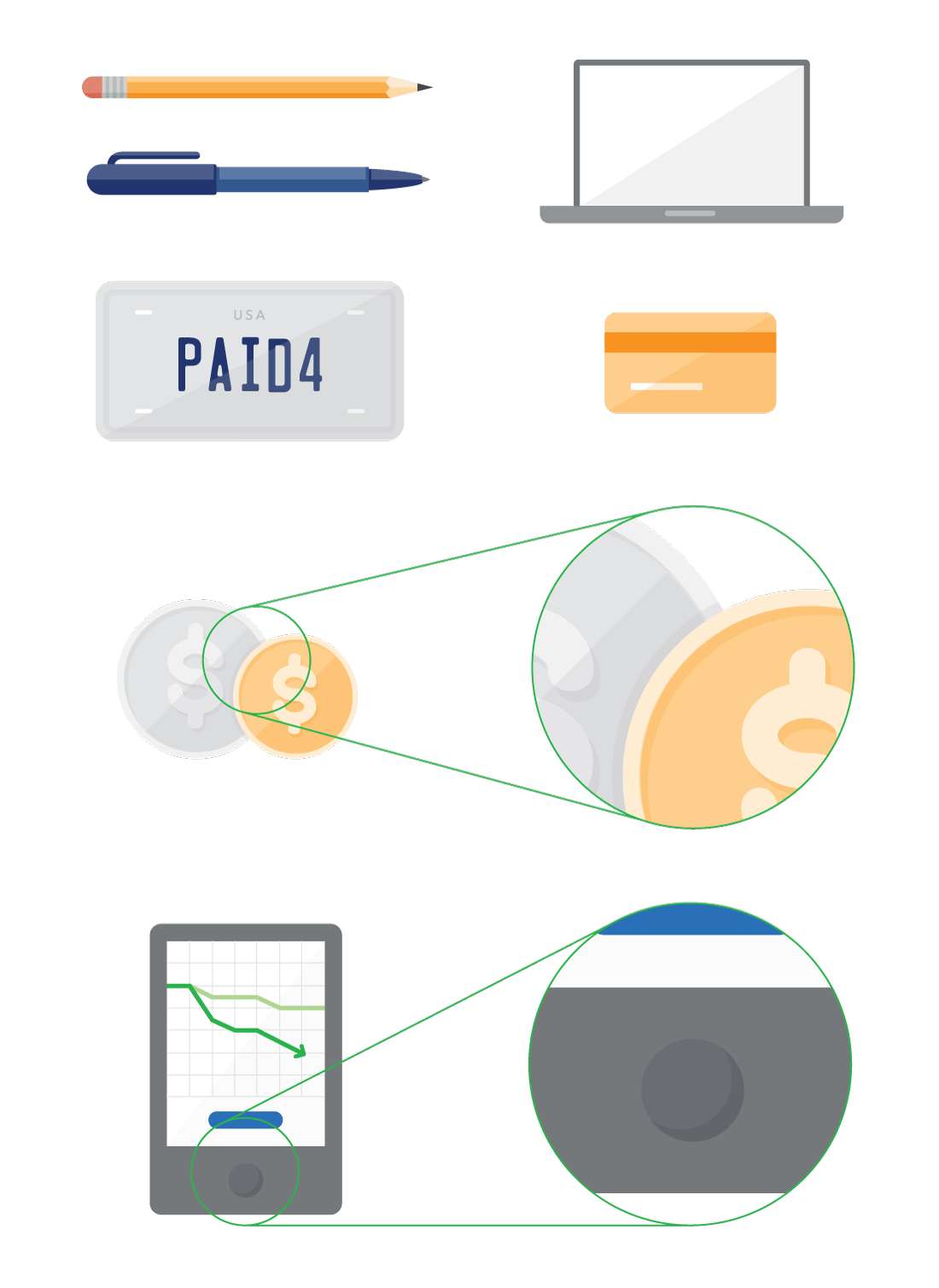
Top-facing illustrations are object-based. Illustrations should be arranged in a way that it appears the viewer is immersed in a real life scenario. These should include 4-6 objects and relative sizing to create a realistic and natural perspective. Shadows around objects can be used to create realism in top-facing perspective. If using top-facing perspective in a project, all illustrations should maintain that perspective for consistency.

Composition
All illustrations should have relative sizing when more than one object is included. Illustrations should appear natural, but stylized. Do not scale-up or collage minicons or isocons for use in illustrations. Minicons can be used as graphic details when scaled appropriately.
Illustrations should be compositionally balanced with related headers and text. Reduce “floating” by bleeding illustrations off the edges of the graphic. Make use of layering and subtle, vector-based background patterns to help ground the illustration. Shadows are appropriate when objects overlap but should not extend outside of objects.
Do not use negative space to define outlines.

Form
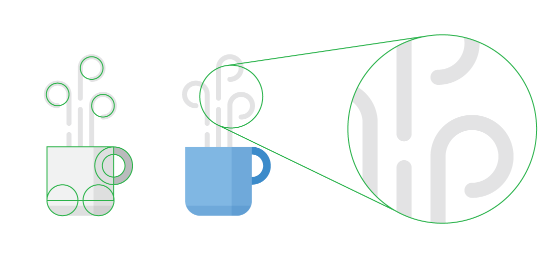
All illustrations should be based on commonly used geometric shapes like circles, triangles, beams, and rectangles.
To stylize illustrations according to CFPB standards, use relative sizing on stroke weights with a rounded end cap. For curved lines, the stylized stroke is recommended throughout illustrations.

Shading and highlights
Objects should be lit from the upper-left side. This is consistent with the beam in our logo. The overall placement of highlights and shading should be carefully decided by the designer and consistent throughout the project.
Shading should be achieved using subtle, solid tints, not gradients, textures, multiply, or blurs.
There are two types of highlights available for illustrations; curved and diagonal. The curved highlight is recommended when the object is round. Diagonal highlights are mostly used in rectangular objects. They are also frequently used to show reflections. To create a diagonal highlight, a tint of the background color is cast from the top-right corner of an object at a 45º angle.

Shadows
Shadows are created using a darker tint of the background color. They are appropriate when objects overlap but should not extend outside of objects. In top-facing illustrations, shadows around objects can be used to create realism.
The overall placement of shadows should be carefully decided by the designer and consistent throughout the project.

Industry illustrations
Industry illustrations are simple graphics that support a key topic or concept. Industry facing illustrations feature flat elements and avoid the illusion of depth by excluding drop shadows and highlights.
The color palette is green and grey, including midtones and tints and a thoughtful use of whitespace.


