Data visualization guidelines
- Bar chart
- Line chart
- Pie chart
- Area chart
- Tile grid map
- Use cases
- Guidelines
- Accessibility
- Related items
Data visualization can be a great way to tell stories, convey meaning, and help users make comparisons. At the CFPB, we’ve built the following styles, guidance, and many of the chart types below into our Content Management System (CMS) and Data visualization Excel file.
Bar chart
Bar charts are good at showing comparisons of discrete items or categories.
Vertical bar chart
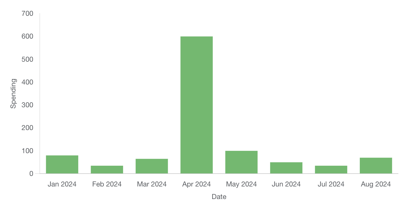
Implementation details
Available for creation in CFPB’s CMS and Excel template
Horizontal bar chart
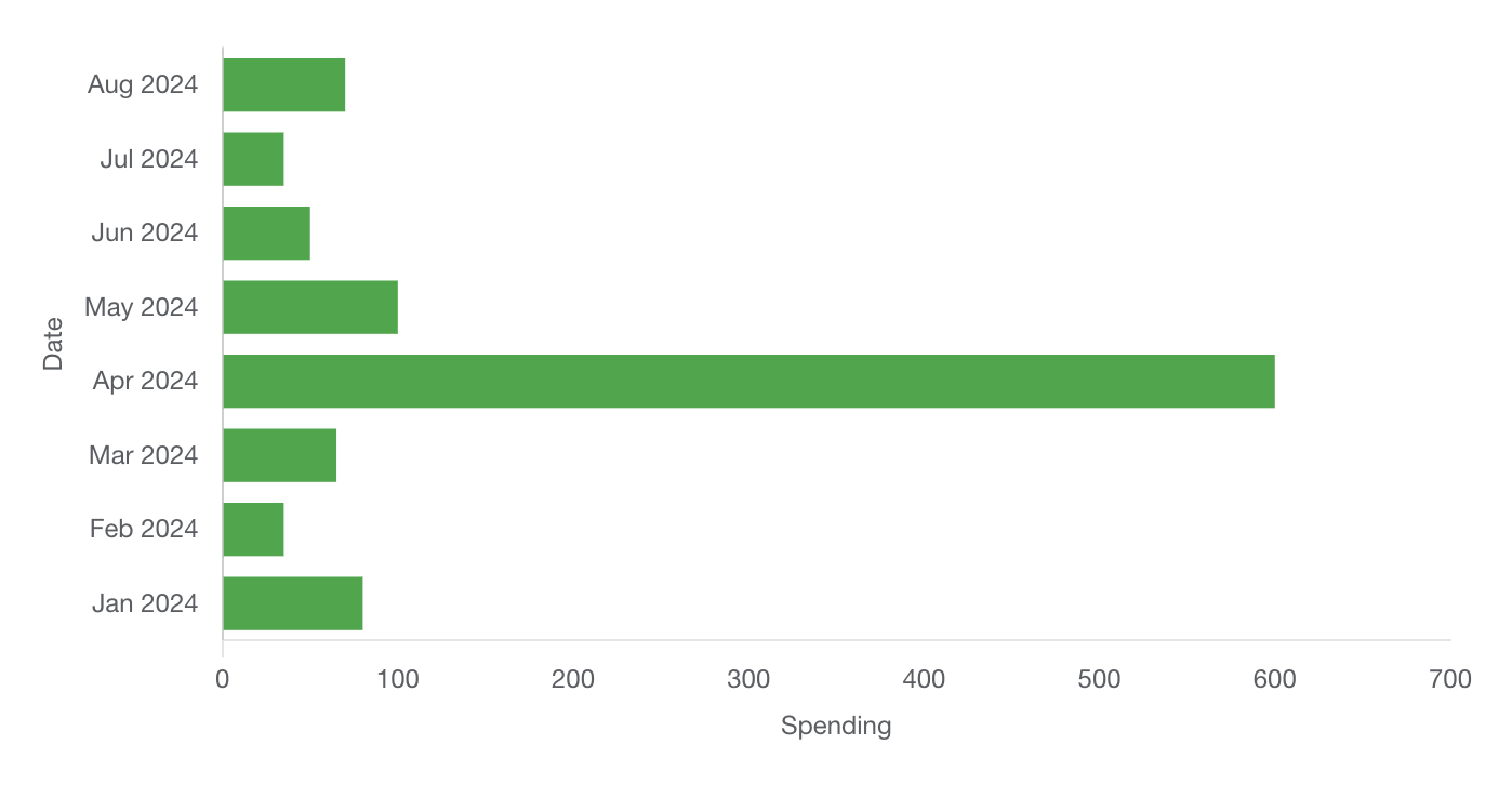
Implementation details
Available for creation in CFPB’s CMS and Excel template
Grouped bar chart
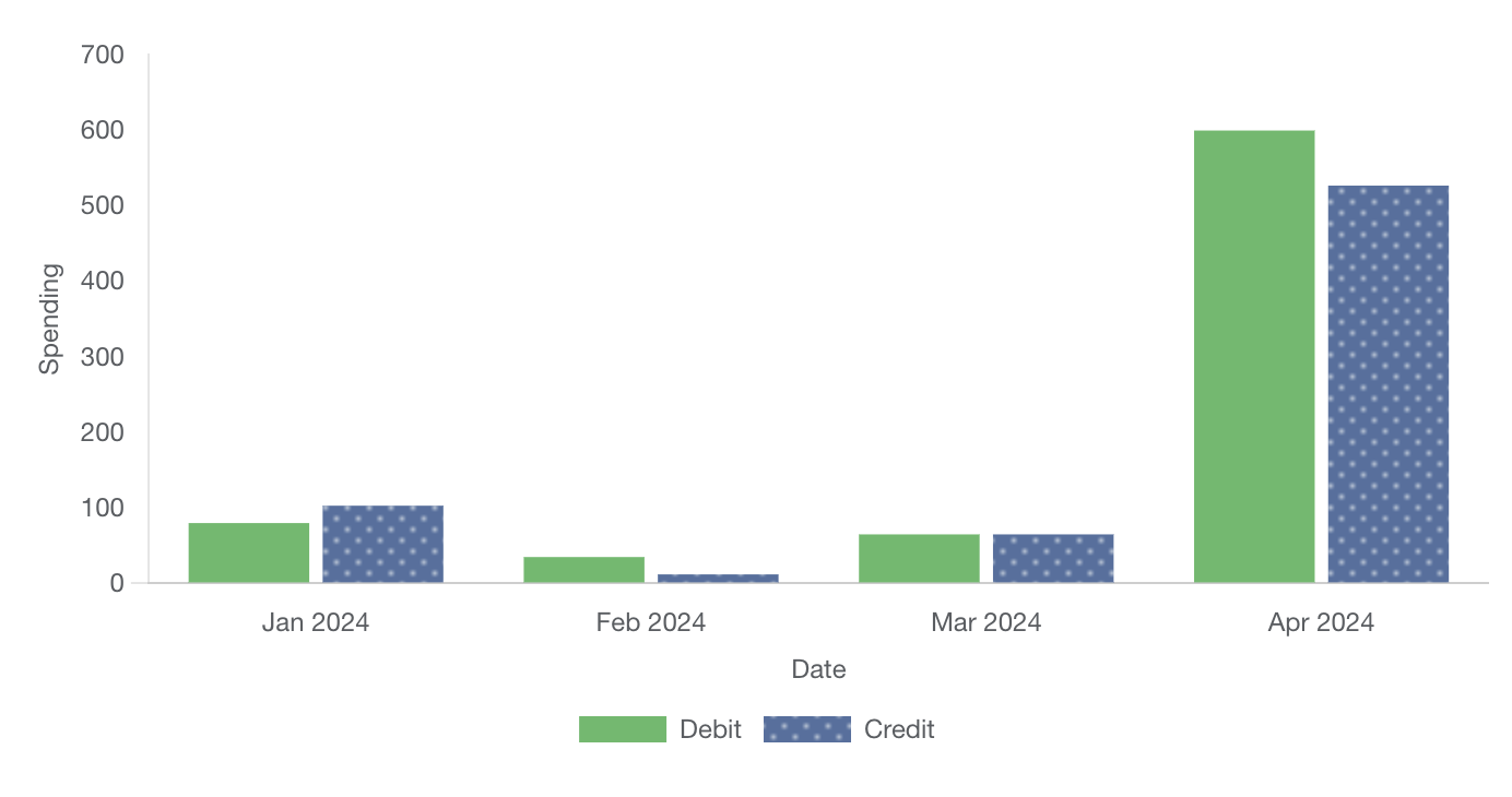
Implementation details
Available for creation in CFPB’s CMS and Excel template
Stacked bar chart
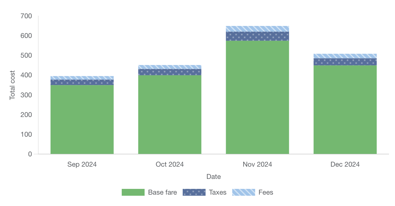
Implementation details
Available for creation in CFPB’s CMS and Excel template
Bar chart stacked to 100 percent
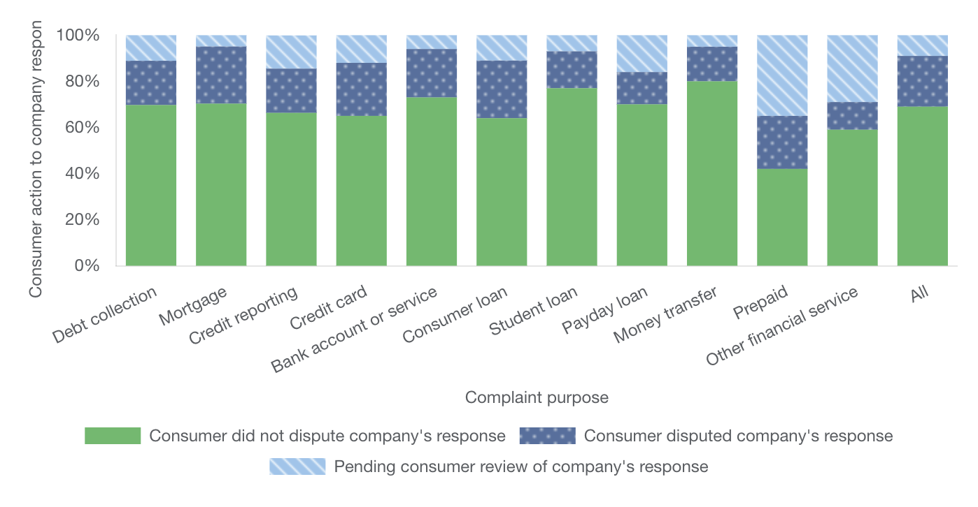
Implementation details
Available for creation in CFPB’s CMS and Excel template
Line chart
Line charts are good at showing a change over time. A line chart’s axis should always start at 0.
Simple line chart
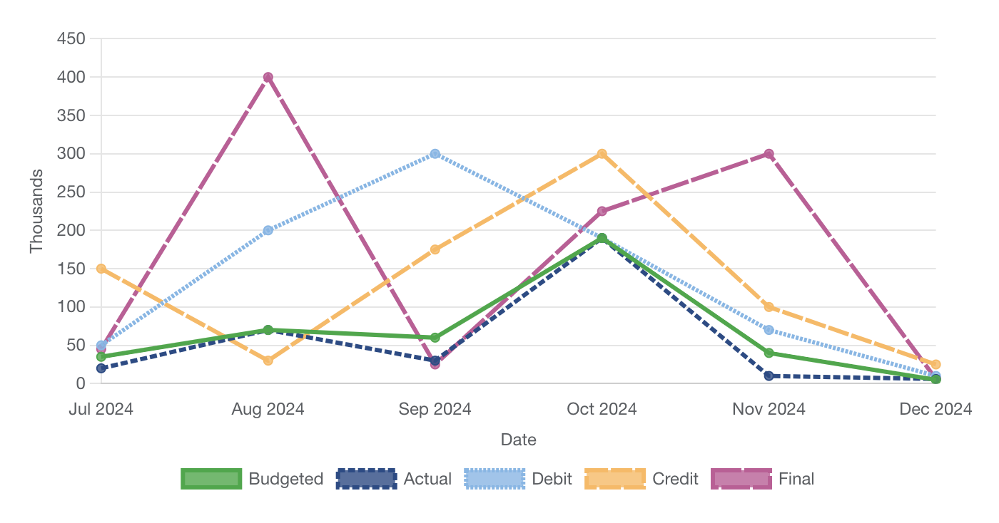
Implementation details
Available for creation in CFPB’s CMS and Excel template
Date/time chart
A date/time chart is a line chart which graphs continuous data over a period of time. The chart includes buttons to select time ranges of 1, 3, or 5 years. The X axis is always based on time, and the period of time can be controlled in more detail with the slider control. Clicking and dragging the handles of the slider changes the length of time displayed in the chart, while moving the slider within the bar changes the starting and ending dates in the chart.
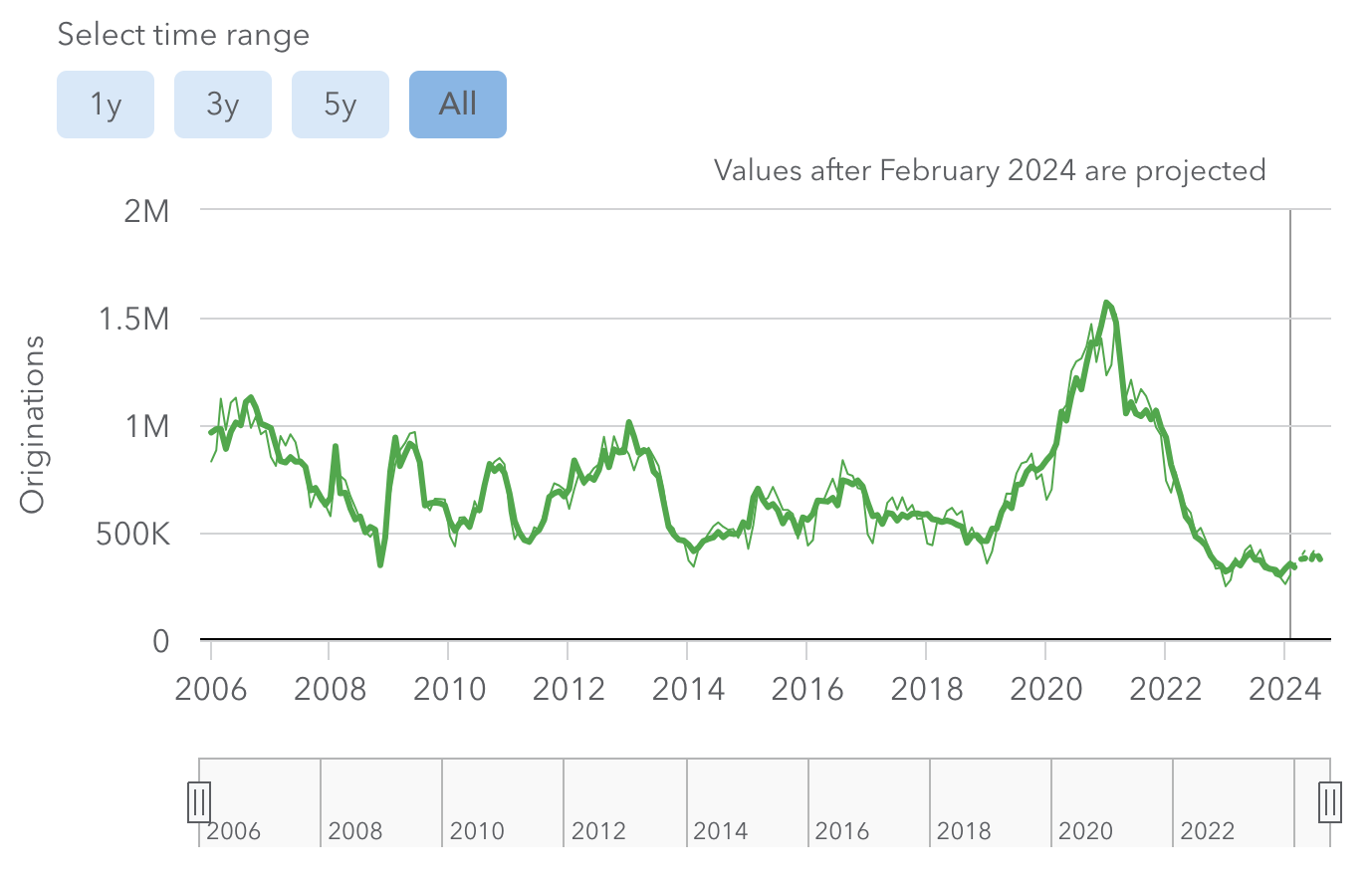
Implementation details
Not currently available for creation in CFPB’s CMS or Excel template. Requires custom development.
Pie chart
Pie charts are good at showing parts of a whole. Slices should always add up to 100 percent.
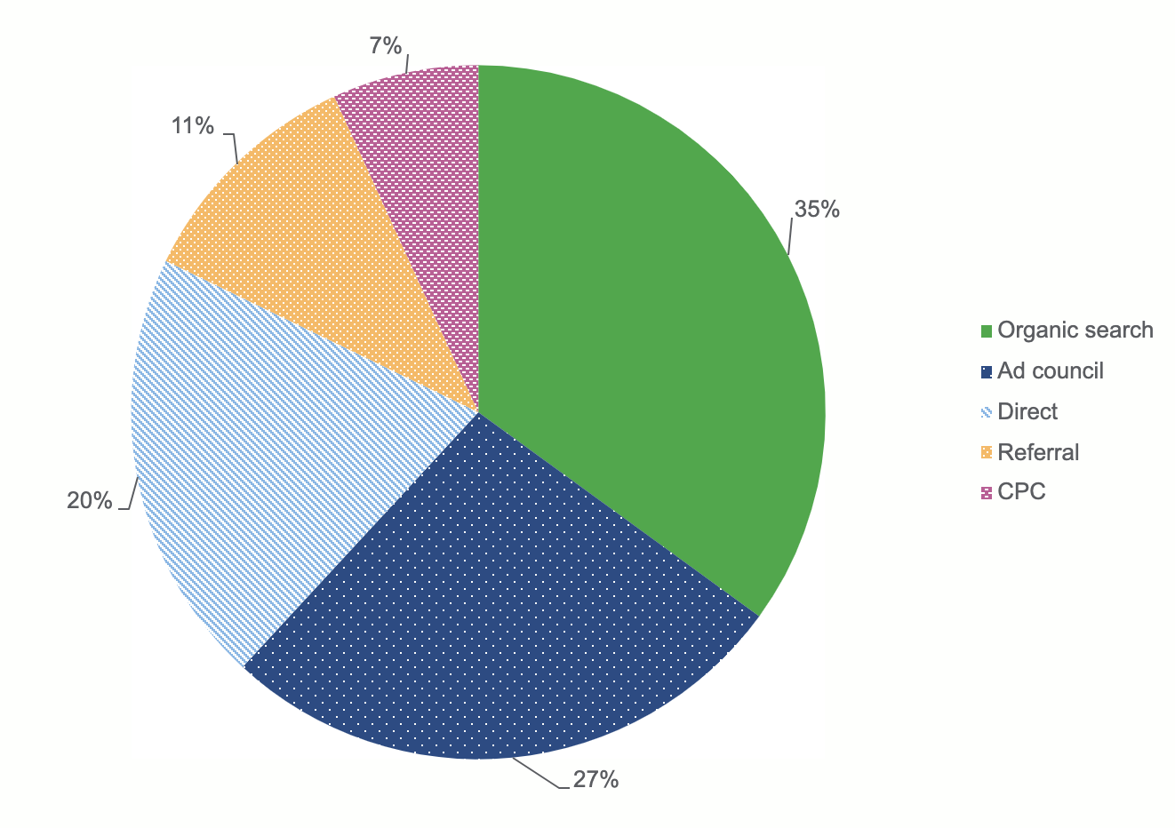
Implementation details
Available for creation in CFPB’s Excel template. Not currently available for creation in CFPB’s CMS.
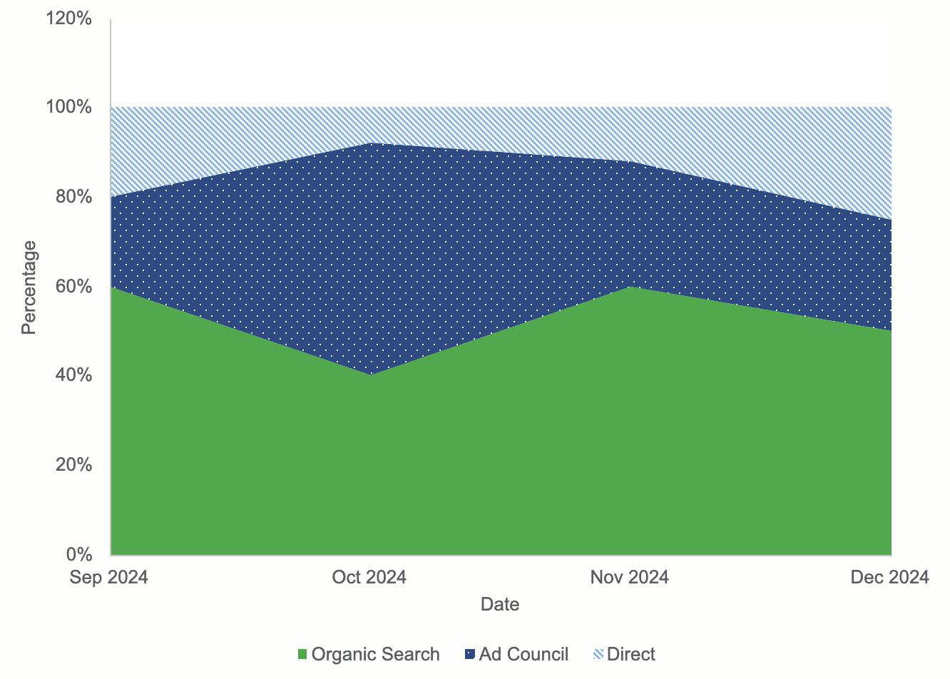
Area chart
Area charts are good at showing trends over time much like line charts. Unlike line charts, area charts use filled areas which help draw attention to the changing values. They are good at emphasizing the size of change over time.
Implementation details
Available for creation in CFPB’s Excel template. Not currently available for creation in CFPB’s CMS.
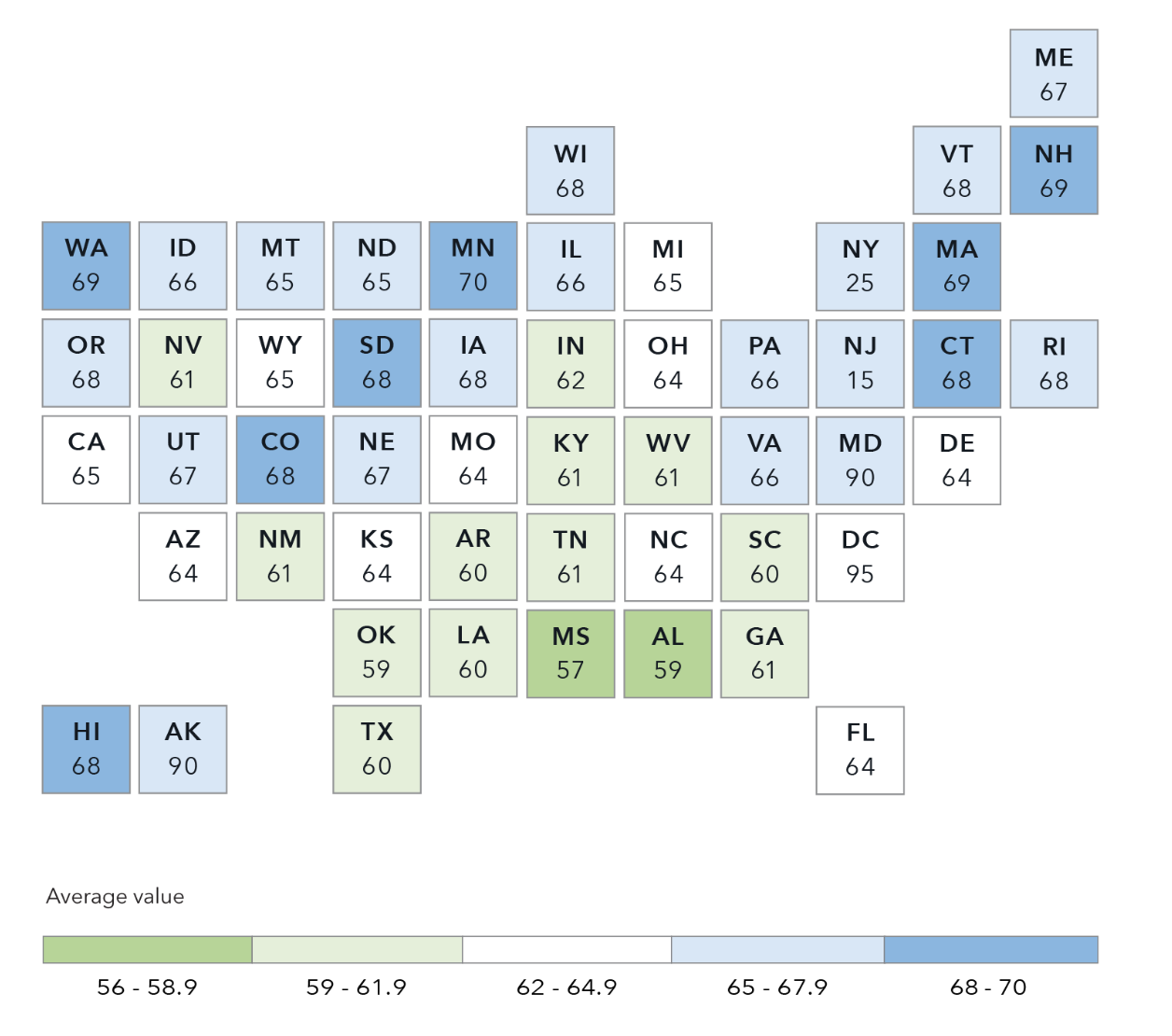
Tile grid map
Tile grid maps can show comparative state data where population figures or geographic size are not part of the story. In tile grid maps, each state is the same size and shape. This prevents regions with large areas from dominating a map and prevent regions with small areas from going unnoticed.
Implementation details
Not currently available for creation in CFPB’s CMS or Excel template. Requires custom development.
Use cases
When deciding if and how to create a data visualization, consider the following.
- Is a data visualization truly the best format for your information? Data visualizations can be powerful in showing aspects such as patterns and comparisons. But sometimes data visualization isn’t the best approach, and a well-crafted sentence or table may actually be more impactful in conveying a specific point.
- Make sure you understand the data before deciding how to visualize it. For instance, bar charts are good at showing comparisons whereas line charts are good at showing a change over time.
- Consider your audience, their familiarity with data visualization, and how much information they need.
- Ensure your data visualization communicates a main point that users can easily recognize and walk away with.
Guidelines
Limited data
Include no more than five data types in your chart to ensure it will be readable and accessible. For example, a line chart should have no more than five lines, and a pie chart should have no more than five slices. If you need to show more than five data types, break your chart into multiple smaller charts.
Accessible colors and patterns
When used properly, color and patterns can help clarify relationships and differences between data and maintain a consistent brand voice. When used poorly, color and patterns can overwhelm the user, make the data confusing, and break with brand standards.
- Color: Refer to our Data visualization color palettes and Color accessibility guidelines when choosing colors for your visualization.
- Patterns: We’ve built the following patterns into our CMS and Excel template: square dot, round dot, dash, and long dash.
Required information
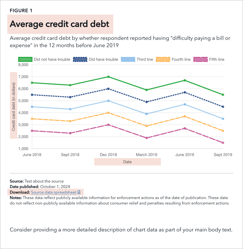
-
Title: The title should be as descriptive as possible to give users a sense of what the chart will be about.
- Character count: No more than a single line at desktop screen size (approx. 95 characters including spaces)
- Axis labels: Include and label one X axis and one Y axis per chart.
-
Downloadable source data: Provide the data used to create the chart in an Excel or CSV file. Within the file, format the data as a table with header columns for accessibility. Please reference this table accessibility video for guidance.
- Download text: Write a short phrase of text to appear as the link text when a user clicks to download the data. The text should succinctly describe the data the file contains so it is clear to a user using a screen reader what they are downloading.
-
Alt text (short description): Alt text should include the chart type, type of data, and main takeaway. This text will not be visible on the page. Rather, it will be read by a screen reader.
- Character count: No more than 250 characters including spaces
- Example: “Line chart showing average credit card debt between June 2018 and September 2019 stayed relatively stable across respondents, whether or not they reported difficulty paying expenses.”
Optional information
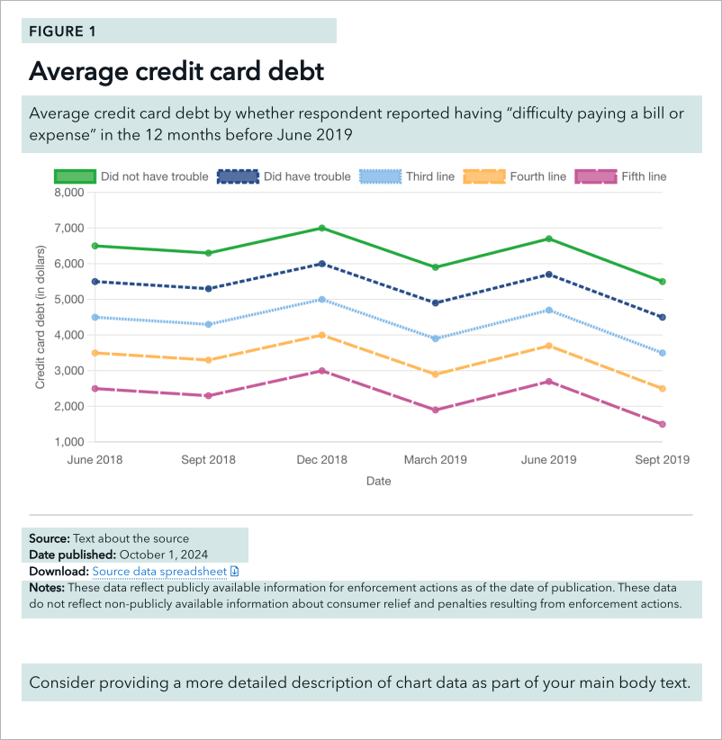
- Figure number: If there will be many charts on a page, include a figure number with each chart. This will appear as text above the chart’s title.
-
Intro text: Can be used to call out key takeaways and trends in the chart data. This will help a user understand why they may want to explore the data.
- Character count: No more than three lines at desktop screen size (approx. 250 characters including spaces)
- Data source: Cite where the data is from. This helps to promote trust and validity. Whenever possible, link to the original source.
- Date published: The date the data in the chart was last updated
- Notes: Include any additional notes about the chart and data to describe aspects such as caveats or inconsistencies with the data.
- Supporting text: Increase the visualization’s accessibility by further describing it in the main body of text. In addition to text placed within the data visualization itself, describe the chart data, trends, and key takeaways in greater detail in the paragraphs directly following the visualization. This is especially necessary for more complex charts.
Accessibility
Enabling all users to comprehend data visualizations is a key part of being a government agency that serves the entire American public.
As stated in the Guidelines section above, please ensure your visualization includes the following.
- Accessible colors and patterns
- Required information including a chart title, alt text, downloadable source data, download text, and axis labels