Interactive charts
Interactive charts, in contrast to static data visualizations, are intended to let users explore a set of data, focus in on the details that interest them the most, and draw their own conclusions from that data. A visualization intended to show a limited set of data to support a specific point would be better served by a static chart.
Line charts
Simple line chart
Simple line charts may use any unit for the x and y axis, and do not include any time-related controls. Line charts may display up to 5 lines of data in total.

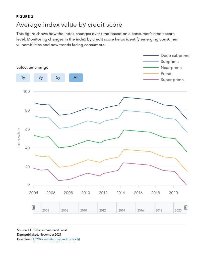
Date/time chart
The most commonly used interactive chart is a date/time chart, a line chart which graphs continuous data over a period of time. The x axis is always based on time and special controls allow users to adjust the time period displayed in the chart. Date/time charts may display up to 5 lines of data in total.

Bar charts
Bar charts shows comparisons of different discrete items, factors, or categories, and do not include any time-related controls. Comparisons can include items that can be counted and categorized.

Tile grid maps
Tile grid maps can be used to show comparative state data, where population figures or geographic size are not part of the story. In tile grid maps, each state is the same size and shape. This prevents regions with large areas from dominating a map and prevent regions with small areas from going unnoticed.

Guidelines
Interactive charts, in contrast to static data visualizations, are intended to let users explore a set of data, focus in on the details that interest them the most, and draw their own conclusions from that data. A visualization intended to show a limited set of data to support a specific point would be better served by a static chart. Interactive charts should follow standard data visualization guidelines with some changes to accommodate the fact that users can change the details of the data displayed.
Content guidelines
Figure number
- Appears above the chart title
- Uses the H5 heading style
Chart title
The chart title provides users a framework for what they are viewing. It also helps with 508 accessibility and decreases the amount of text necessary in alt tags.
- Chart titles should be no longer than a single line of text at desktop (approximately 95 characters including spaces)
- Should be as descriptive as possible to give users a sense of what the chart will be about
- Uses the H2 heading style
Subtitle
The subtitle should provide further context about what is important about the chart data and why a user might be interested in exploring the data.
- Should include no more than three lines of text at desktop (approximately 250 characters including spaces)
- Uses the body text paragraph style
Source
Clearly states where the data is from to promote trustworthiness and validity.
Date published
Reflects the date the data in the chart was last updated
- Uses the chart footnote style
Download
Provide a link to CSV or other downloadable file with the data used to generate the chart.
-
Link text should clearly describe the data being downloaded, particularly if there are multiple charts on a single page, in which case the link text should make it clear to a screen reader user which data each file contains.
Behavior
All interactive charts include a legend in the top right corner of the chart, labeling all data series displayed in the chart.
All interactive charts include a hover state labeling the line, column or tile, the value of the chart at the location of the cursor, and the x-axis value in the case of line charts. On line charts, the line currently under the cursor becomes 3px thick and, in the case of multi-series line charts, the other lines shift to a lighter tint of the color used.
Date/time charts include buttons to select time ranges of 1, 3, or 5 years. Selecting a button will display the most recent data for the selected length of time. The period of time can be controlled in more detail with the slider control. Clicking and dragging the handles of the slider changes the length of time displayed in the chart, while moving the slider within the bar changes the starting and ending dates in the chart.

Accessibility
Accessible text descriptions should be provided for every interactive chart. The description should help provide information that is easy to see by a sighted person viewing the chart, but not duplicate text available elsewhere on the page, such as in the chart title or subtitle. Make sure the information is descriptive but succinct.
Because the text description is not enough to provide a complete picture of the possible conclusions that can be drawn from an interactive chart, always provide a link to a machine-readable data format with the data so people without vision can tab through the data with a screen reader. The data should have descriptive column labels. The link text should clearly describe the data being downloaded, particularly if there are multiple charts on a single page, in which case the link text should make it clear to a screen reader user which data each file contains.