Designing forms
Web forms provide an incredible advantage over paper forms in their potential for accessibility, usability, and operational efficiency, but when designed without users in mind, they can lose many of these benefits. In this guide, we’ve outlined several ways to ensure the best possible user experience.
Types
The structure of your form should fit with the ways in which your users will want to use it.
Ask yourself:
- Will your users want to move through the form in a fixed order, or one of their choosing?
- Will they be able to complete the form in a single go?
- Will their answers affect other parts of the form?
- Will they want to go back and review or change answers to previous questions?
- Will they need to add or remove items from a list, or change the order of things?
- How many parties are involved in the form?
- Do any parts of the form take place offline?
- At what point is the form regarded as complete?
How you answer these questions will help you decide how to structure the form. It can help to think in terms of levels: sections, subsections, groups, etc. Try not to worry about how those levels should be represented in the interface until you have a broader understanding of the overall structure.
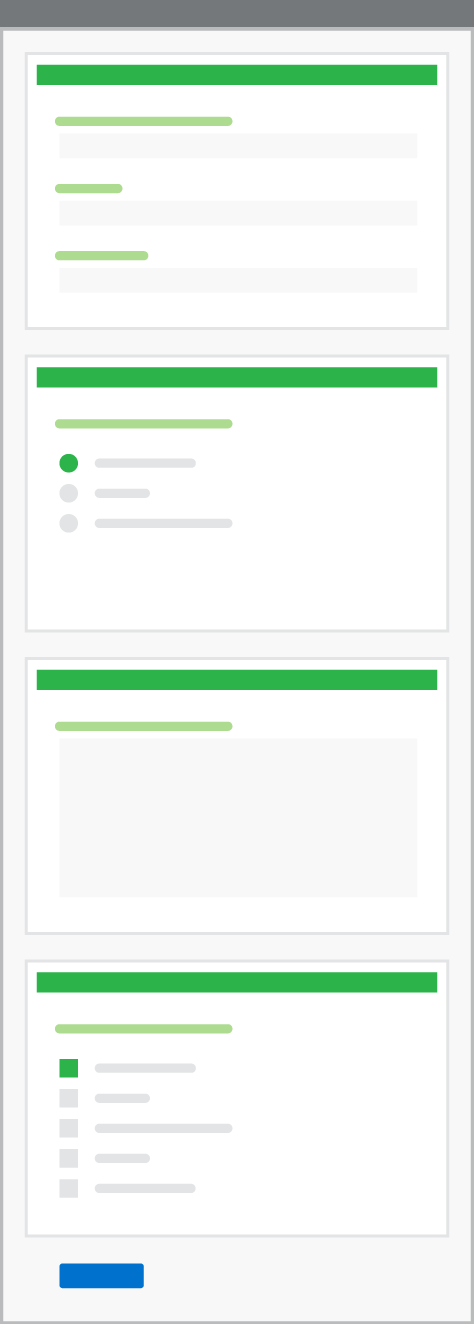
Single page
All sections are positioned on a single page.
The good
- Only one submit button to press
- Single URL gives access to all form fields
- Doesn’t force a fixed order of completion
- Offers context of neighboring sections
- Progress is self-evident
The bad
- Long forms can be overwhelming and off-putting
- Less well suited to branching or non-linear flow
- How do you save partial progress?
- Can be harder to track analytics like drop-off rates
Wizard
Each section goes on its own page.
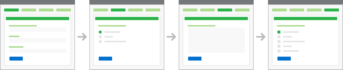
The good
- Easier to handle branching and dependencies between sections
- Easier to let the user save progress
- A way to make a long form feel more manageable
- Easier to guide a user through an unfamiliar process
- Easier to capture analytics like drop-off rates for each section
The bad
- Can be harder for users to see where they are within the form
- Can slow users down as they have to click and load each section
- Loses the contextual information from neighboring sections
- Harder for users to review and edit previous sections
- No single place for users to go back and edit their data
- Not a natural fit for non-linear processes like looping, adding and removing
Accordion
All sections are on a single page, but each new section only appears once the previous section has been completed. Done well, option 3 is a hybrid of the other two that has benefits of both.
Within this hybrid option there are still some important design decisions to make, for example:
- Will future questions be shown in any way or will you only see the questions you’ve answered?
- What happens if you go back and edit a previous question?
- Does the current question stay open or closed?
- How do you get back to the current question once you’ve edited a previous one?
- Do you lose all your answers to questions that follow the one you go back to edit?
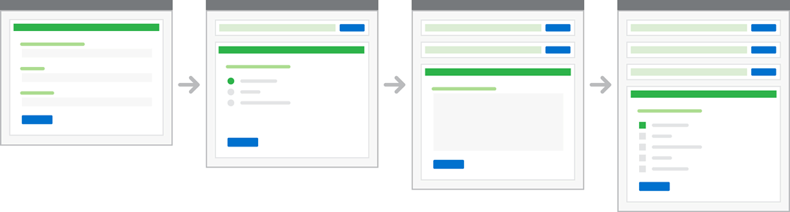
The good
- Can handle branching and dependencies between sections
- Can easily review and edit previous questions
- Can help guide a user through an unfamiliar process
- User still benefits from some surrounding context
- Progress is clear
The bad
- Implementation and interface is more complex
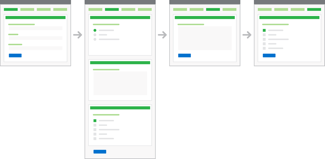
Hybrid
For more complicated forms, some combination of the other options might be your best bet. Done well, this can give you the benefits of both the single page and wizard approaches. It also allows you to create a sense of rhythm to the overall flow, which can help users understand when they have moved into a different part of the form, and break up the monotony of filling in forms.
As always, these design decisions must have a strong, user-centered rationale behind them.
Guidelines
Setting expectations
Be honest about what you’re offering and not offering to someone who completes a form. In particular, people need to know up front about any:
- Costs involved
- Waiting periods or delays
- Uncommon or hard-to-find information they’ll need to provide
- Constraints on who can complete the form (age, nationality, etc)
- Equipment that will be required (e.g., a printer)
- Non-digital parts of the form
It’s important to communicate clearly, but avoid making someone read a page of terms and conditions before they start. The best approach is to meet—or exceed—people’s expectations. For example, if your delivery times are typical and you accept all the usual payment methods, you won’t need to warn someone about them up front.
The further into a form someone gets, the more time they have invested and the greater their annoyance will be if they need to abandon it for some reason.
Keeping it simple
Every request for information from a person:
- Requires additional physical and cognitive effort
- Creates another opportunity for them to get something “wrong”
- Increases the time it takes to complete the form
- Increases the perception that the service is invasive
- Increases the risk that they will give up or fail to submit your form
Asking for information because “it might be useful” or “it helps with our record keeping” should be considered against all of these factors.
Saving progress
If the average time to complete a form is more than you can reasonably expect someone to spend in a single session, you need to provide a way for them to save their progress.
The same goes if the session is likely to be interrupted for some reason, for example, if the person is suddenly asked for information which they might not have immediately on hand. Another example is that a person might start a form on their mobile device and want to continue filling it out on their desktop computer.
Providing extra help
You should be aiming for a service that’s so intuitive people don’t need help using it. If you find yourself explaining the interface within the interface, it’s a sign that something has gone wrong.
Sometimes though, people are going to need extra help. Many government forms involve concepts and terminology that people will be unfamiliar with. Some of this stuff takes a lot of explaining, so we need a way of providing contextual help of varying degrees of detail throughout a form.
- Inline help: Short, snappy text positioned near the part of the interface it refers to. If it’s something that everyone needs to know, make it permanently visible.
- Progressive disclosure: A fancy phrase for hiding stuff until it’s clicked. Used carefully, this is a good way to keep the interface free from potentially confusing clutter. Only use this for help that’s intended for a small subset of your audience (say, less than 10%).
- Field masking: When a specific data entry format is required—such as phone numbers, dates, and social security numbers—provide an example of the required format (e.g., XXX-XX-XXXX).
- Rich contextual help: Sometimes you need to give someone access to supporting content in case they’re unfamiliar with the terminology or concepts involved in the form. This kind of content should probably exist as a page outside of the form and then be repurposed in some way within the form.
Communicating errors
Despite providing the best possible helper text and contextual help, you should still plan for when someone make errors when filling out your forms.
- Indicate optional and/or required fields. If most of the fields are required, leave them alone and just mark the optional fields as optional. If most of the fields are optional, leave them alone and just mark the required fields as required. If it’s close to a tie, go with whichever choice might be better for your users.
- Combine field-level error text with a page-level error message. This is particularly important for accessibility. If someone is using a screenreader to navigate the page, a digest of errors at the top of the page will help them understand which fields need fixing. Including anchor links to the invalid fields will allow them to find and fix the error without re-navigating the entire form.
- Be descriptive with error text. Tell the user what caused the error and how to correct it.
- Validate fields before the user submits. Check for errors as someone fills out the form (e.g., using javascript) and provide inline messaging with instructions for how to correct the error. Also consider including affirmative inline validation (such as green checkmarks) for required text fields, especially those that require specific formats or character counts, such as Zip Codes and passwords.
Research
This guide on effective forms has been adapted from the guide Designing transactions in the GOV.UK Government Service Design Manual, which is licensed under the Open Government License v2.0.