Creating and Editing Wagtail Components
consumerfinance.gov implements a number of components that editors can choose from when building a page, for example: Heroes, Expandable Groups, or Info Unit Groups. The CFPB Design System describes the design and intended usage of many of these components.
In Wagtail parlance, these are called "StreamField blocks"* (or just "blocks"). We sometimes also refer to them as "modules", because we think that the terms "component" and "module" may be more obvious to non-developers. This page will use the terms somewhat interchangeably. One other important thing to note before we begin: blocks can be nested within other blocks.
* If you're going to be doing anything more than making minor updates to existing components, this is highly recommended reading.
Table of contents
- The parts of a Wagtail block
- The back end
- The front end
- How-to guides
- Creating a new component
- Adding a field to an existing component
- Editing a field on an existing component
- Removing a field from an existing component
- Creating migrations for StreamField blocks
The parts of a Wagtail block
Blocks are implemented via several different bits of code:
- Defining a block's fields and other properties in a Python class
- Adding the class to a page's StreamField block options
- Creating an HTML template for rendering the block on a page
- (Optionally) adding some CSS for styling the block
- (Optionally) adding some JavaScript for adding advanced behavior
Before you dive in further, check out the Notes on Atomic Design page and familiarize yourself with our basic concepts of atoms, molecules, and organisms.
The back end
The Python class
A component's fields and other properties are defined in a Python class,
typically a subclass of Wagtail's
StructBlock.
These classes are located in a number of different files across the repository,
but there are two major categories they fall into:
- Files corresponding to a general-purpose, site-wide atomic component.
These files—
atoms.py,molecules.py, andorganisms.py—are located incfgov/v1/atomic_elements. - Files that are specific to a particular sub-app, such as regulations3k's blocks.py.
There are other places where StreamField block classes are defined (particularly blocks that are only ever used as fields within another block), but these are the two most common locations where top-level Wagtail modules are stored.
A simple component class looks like this:
class RelatedContent(blocks.StructBlock):                      # 1
    heading = blocks.CharBlock(required=False)                 # 2
    paragraph = blocks.RichTextBlock(required=False)           # 3
    links = blocks.ListBlock(atoms.Hyperlink())                # 4

    class Meta:                                                # 5
        icon = 'grip'                                          # 6
        label = 'Related content'                              # 7
        template = '_includes/molecules/related-content.html'  # 8
There are a few things happening here:
- The
RelatedContentclass is a subclass of Wagtail'sStructBlock, which allows for the combination of a fixed number of other sub-blocks (see previous comment about blocks being nested within other blocks) into a single unit (what we'd think of as a "module" in the Wagtail editor). This one has three sub-blocks (lines 2, 3, and 4). - The
headingfield uses the basic WagtailCharBlock, which results in a field with a basic single-line text input. - The
paragraphfield uses the basic WagtailRichTextBlock, which results in a field with a multiline WYSIWYG text input. - The
linksfield uses another basic Wagtail block,ListBlock, which is a special type of block that can hold a variable number of some other block (theHyperlinkatom block, in this case). - The
Metaclass defines some properties on theRelatedContentblock that are used by the Wagtail admin or in rendering the block. - The
iconproperty tells Wagtail what icon to use in the editor for the button you use to add aRelatedContentblock to a StreamField. Icon options can be found in the Wagtail style guide when running locally: http://localhost:8000/admin/styleguide/#icons - The optional
labelproperty overrides the text of that same button; iflabelis not set, Wagtail will generate one from the name of the block. - The
templateproperty is a pointer to the HTML template used to render this component. See below for more on templates.
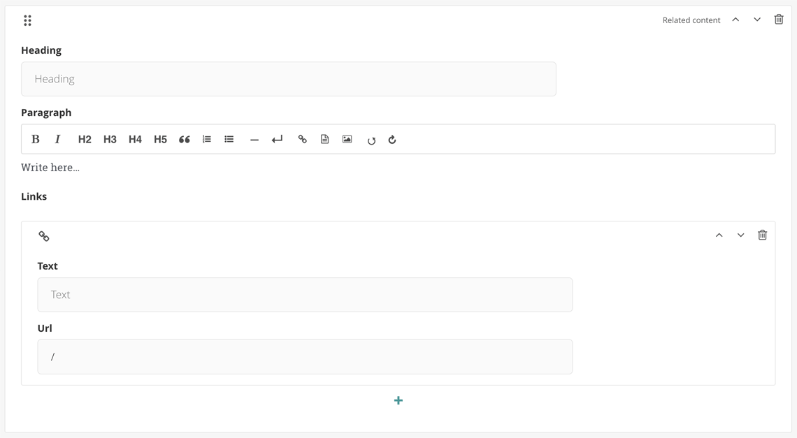
This results in a module that looks like this in the Wagtail editor:
Note again that what we think of as fields are also blocks,
and what we think of as components or modules
are a special kind of block, StructBlock,
that comprise the sub-blocks that are our fields.
There are two common optional things that are also used in component classes:
- Overriding the default
get_contextmethod to pass additional data to the template - Adding component-specific JavaScript
via the
Mediaclass
Adding it to a StreamField
Components are made available in the page editing interface
by adding them to one of a page types's StreamFields.
These are usually the first things in a page's class definition.
For example, see this snippet from
blog_page.py:
class BlogPage(AbstractFilterPage):
    content = StreamField([
        ('full_width_text', organisms.FullWidthText()),
        ('info_unit_group', organisms.InfoUnitGroup()),
        ('expandable', organisms.Expandable()),
        ('well', organisms.Well()),
        ('email_signup', organisms.EmailSignUp()),
    ])
    …
This sets up a StreamField named content that allows for
the insertion of any of those seven listed blocks into it.
To make the RelatedContent module (shown above) available to this StreamField,
we'd add a new entry to this list following the same format:
('related_content', molecules.RelatedContent()),.
Most page types have two StreamFields (header and content) in the
general content area (the first tab on an editing screen), and most also share
a common sidefoot StreamField
(so named for the fact that it appears on the right side on some page types,
but in the footer on others) on the sidebar tab.
Don't forget the migrations!
Adding or changing fields on either Python class will always require a new Django schema migration; additionally, changing field names or types on an existing block will require a Django data migration. See the guide on creating migrations for StreamField blocks for more details.
The front end
Before diving into the front-end code, a reminder to visit the Notes on Atomic Design page to learn about how we conceive of components in a hierarchy of atoms, molecules, and organisms.
The HTML template
Frontend rendering of Wagtail StreamField blocks to HTML
can be controlled by writing a Django template
and associating it with the block type.
A custom block definition can specify the template path in its Meta class:
from wagtail import blocks


class PersonBlock(blocks.StructBlock):
    name = blocks.CharBlock()
    email = blocks.EmailBlock()

    class Meta:
        template = 'myapp/blocks/person_block.html'
StreamField block templates are loaded by the Django template loader
in the same way that Django page templates are.
The specified template path must be loadable
by one of the Django template engines configured in
settings.TEMPLATES.
(This project supports both the standard
Django templates backend
and the
Jinja2 backend,
but Jinja2 is more commonly used.)
See the Django templates documentation
for more details on the search algorithm used to locate a template.
Returning to the RelatedContent example,
this is what its Jinja2 template looks like (comments excluded):
<div class="m-related-content">
  {% if value.heading %}
  <header class="m-slug-header">
    <h2 class="m-slug-header__heading">{{ value.heading }}</h2>
  </header>
  {% endif %} {{ value.paragraph | safe }} {% if value.links %}
  <ul class="m-list m-list--links">
    {% for link in value.links %}
    <li class="m-list__item">
      <a href="{{ link.url }}" class="m-list__link">{{ link.text }}</a>
    </li>
    {% endfor %}
  </ul>
  {% endif %}
</div>
When Wagtail renders a block,
it includes the values of its fields in an object named value.
Above, you can see where the heading and paragraph fields are output with
Jinja2 expression tags.
And note how the links field (a ListBlock) is iterated over,
and the values of its Hyperlink child blocks are output.
That's about as simple an example as it gets, but block templates can get much
more complex when they have lots of child blocks and grandchild blocks.
Also, if a block definition has overridden get_context to pass other data
into the template (as described at the end of
the Python class section above),
those context variables can also be output with simple Jinja2 expression tags:
{{ context_var }}.
Adding CSS
If a component needs any custom styling not already provided by the Design System or consumerfinance.gov, you can add it by creating a new SCSS file for the component.
Note
Please be sure that you actually need new SCSS before creating it. We have a wide array of styles already available in the Design System components and here in consumerfinance.gov, some of which could perhaps be combined to achieve your desired result. Also be sure that new component designs have gone through our internal approval process before adding them to the project.
If you're working on a general-purpose atomic component
for site-wide use, this file should live in
cfgov/unprocessed/css/<atoms|molecules|organisms>/.
(Choose the deepest folder according to the atomic rank of the component.)
Continuing the RelatedContent example, if it needed its own styles,
it would live at cfgov/unprocessed/css/molecules/related-content.scss.
Newly-created SCSS files need to be imported (with @use) into the project's
main main.scss file, located at cfgov/unprocessed/css/main.scss.
Please place them in the appropriate section for their atomic rank.
Because consumerfinance.gov uses main.scss to build a single CSS file
for almost the entire project, it is not necessary
to tell the Python model anything about a component-specific stylesheet
(for general-purpose, site-wide components).
That is not the case with JavaScript, as we will see in the next section.
Note
If you're working on a component that belongs to a particular sub-app,
its SCSS file should live in cfgov/unprocessed/<app-name>/css/.
Adding JavaScript
Each atomic component may optionally be given a Media class that can
list one or more JavaScript files that should be loaded when using it.
When a page is requested via the browser,
code contained in base.html
will loop all atomic components for the requested page and
load the appropriate atomic JavaScript bundles.
Here is how one would add the Media class to our RelatedContent example:
class RelatedContent(blocks.StructBlock):
    …  # see first example on this page

    class Media:
        js = ['related-content.js']
(The related-content.js file would need to be placed in
cfgov/unprocessed/js/molecules/;
see Notes on Atomic Design.)
This will load the related-content.js script on any page
that includes the RelatedContent molecule in one of its StreamFields.
How-to guides
Creating a new component
- Review the Notes on Atomic Design page.
- Add each of the parts mentioned above:
- Create the Python class
- Add the class to a StreamField
- Create an HTML template for the component
- (Optionally) add some CSS
- (Optionally) add some JavaScript
Note
Before creating a new component, please consider whether one of our existing components can meet your needs. Talk to the consumerfinance.gov product owners if your content has specific display requirements that aren't served by an existing component, or if a specific maintenance efficiency will be gained from a new component.
Adding a field to an existing component
- Locate the Python class of the component you want to add a field to.
- Add the field by inserting a snippet like this in the list of fields,
in the order in which you want it to appear in the editor:
field_name = blocks.BlockName(). - Replace
field_namewith a succinct name for what data the field contains - Replace
BlockNamewith one of the basic Wagtail block types. Sometimes we create our own custom blocks that can be used, as well. See, for example, theHeadingBlock, used inInfoUnitGroup, among other places. - Add any desired parameters:
required=Falseif you do not want the field to be required (it usually is, by default)label='Some label'if you would like the editor to show a label more meaningful than the sentence-case transformation of the field namehelp_text='Some text'if the field needs a more verbose explanation to be shown in the editor to make it clear to users how it should workdefault=<some appropriate value>if you want the field to have a specific default value, e.g.,Trueto have aBooleanBlockcheckbox default to checked.- Certain blocks may take other arguments, as described in the basic Wagtail blocks documentation.
- Edit the component template to do something with the field's data – output it, use it to trigger a CSS class, etc.
- Create a schema migration.
Editing a field on an existing component
- Determine if the change you want to make will need a data migration.
- If the answer is no: make your changes, create a schema migration, and be on your merry way.
- If the answer is yes: continue on.
- Add the new version of the field.
- Create a schema migration for adding the new field.
- Create a data migration to copy data from the old field into the new field.
- Edit the component template to use the new field's data instead of the old field's data.
- Remove the old field.
- Create a schema migration for removing the old field.
Removing a field from an existing component
These instructions presume that you do not care about any data stored in the field you are deleting. If that is not the case, please go up to the instructions for editing a field and come back here when instructed.
- Locate the field you want to remove in the block's Python class.
- Delete the field definition.
- Create a schema migration.
Creating migrations for StreamField blocks
To automatically generate a schema migration, run
./cfgov/manage.py makemigrations -n <description_of_changes>
from the root of the repository.
You may also need a data migration
Some field edits (like changing the default, label, help_text,
and required properties, or changing the order of fields on a block)
do not require a data migration. A schema migration is sufficient.
Data migrations are required any time you:
- rename an existing field
- change the type of an existing field
- delete an existing field
- rename a block within a StreamField
- delete a block
if you do not want to lose any data already stored in that field or block.
In other words, if an existing field or block is changing, any data stored in that field or block has to be migrated to a different place, unless you're OK with jettisoning it.
Not sure if there's actually any data that could potentially be lost?
You may not know off the top of your head if a component you are modifying actually has any data stored that could be lost. One way that you can manually check to see if this is the case is to use the Block Inventory feature that we added to Wagtail. This feature lets you search all Wagtail pages on the site for the presence of a component. Here's how:
- With a current database dump, visit http://localhost:8000/admin/inventory/. (This is also available from the admin menu by going to Settings > Block Inventory.)
- Using the three pairs of dropdown menus at the top of the page, choose to look for pages that either include or exclude particular components.
- If multiple components are selected, resulting pages must match all of the conditions.
- Click Find matching pages to execute the search.
- If no results are found, lucky you! You're in the clear to make whatever changes you desire to that component without worrying about data loss.
- If, more likely, there are results, you should open each result, look through the page for the instance(s) of the component in question, and see if the changes you want to make would cause the loss of important data.
If there is only a small amount of potential data loss, it may be more practical to forego the data migration and manually replace that data once the code changes have been deployed. If you think this is the preferable route, consult with the appropriate stakeholders to confirm that they are OK with the window of time in which users may experience a gap in the data that is being manually replaced.
For more details on both kinds of migrations, see the Wagtail Migrations page.