Chart components
Using the appropriate font not only increases consistency with the core brand, but assures legibility and good visual hierarchy. Proper labeling and titles help users quickly understand the chart and increases comprehension as well as helping with accessibility.
Key questions
- Does your chart have a descriptive title and subtitle so someone who cannot see the chart could understand the general trends?
- Have you included notes and a data source?
- Is it clear when the data is from?
Font
All data, labels and titles for data visualizations should be in a sans-serif font. The preferred choices for fonts are: Avenir Next over Arial, and Arial over another sans serif font.
While serif fonts are generally easier to read for long blocks of text, data visualizations rarely include long blocks. The lack of serifs, especially on numbers, helps cut down on the amount of lines and visual clutter. This lack also increases the legibility of small text by eliminating thin serifs.
Titles
Titles should be as descriptive as possible to give users a sense of what the chart will be about. This not only provides users a framework of what they are looking at, but also helps with 508 accessibility and decreases the amount of text necessary in alt tags.
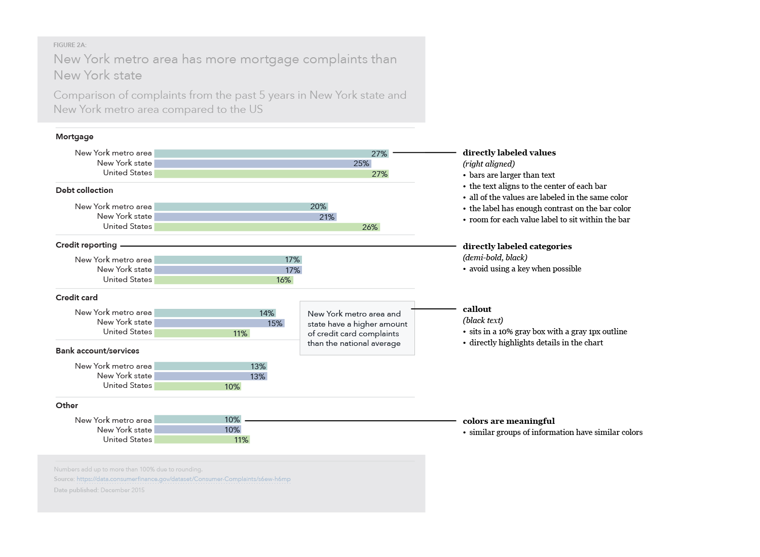
Labels and keys
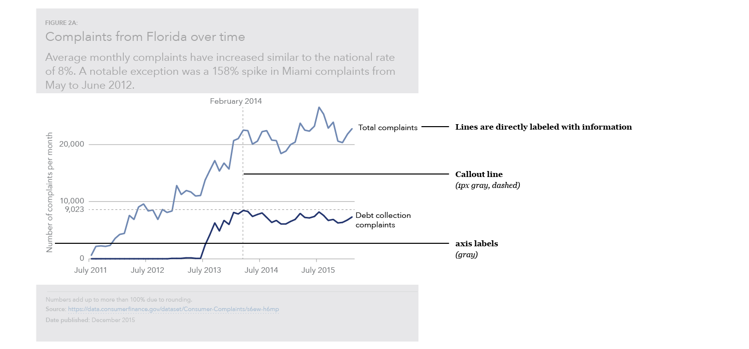
Wherever possible, charts should not include a key, and data should be directly labeled. This reduces the cognitive burden for the user so they are not hunting for labels and trying to connect colors to the data.
Reports
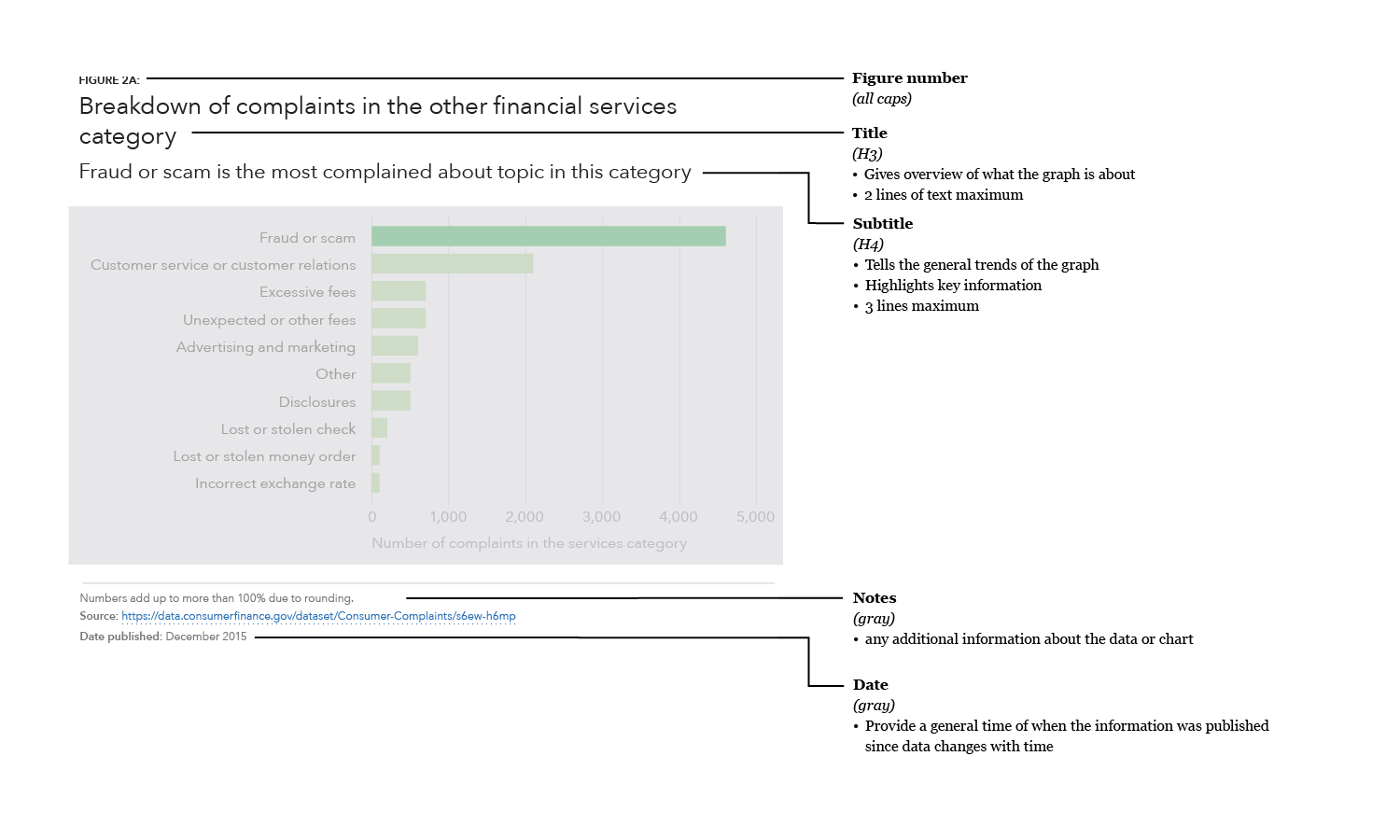
Figure number
- Uses the
Figure numberstyle (all caps)
Title
- Gives an overview of what the graph is about
- Uses the
h3heading style - 2 lines of text maximum
Subtitle
- Explains the general trends of the graph and what that means, including why it is important
- Uses the
h4heading style - 3 lines of text maximum
Notes
- Describes any caveats or inconsistencies with the data such as explaining why numbers do not add up to 100% or the specific dates that the data is pulled from
Data source information
- Provides a link to the URL of a spreadsheet or to the source of the data
- Important to include for trustworthiness and validity
- Allows people to dive deeper into the data and explore the nuances for themselves or to replicate the visualization
Blog posts
Title
- Gives an overview of what the graph is about
- Uses the
h3heading style - 2 lines of text maximum
Subtitle
- Explains the general trends of the graph and what that means, including why it is important
- Uses the
h4heading style - 3 lines of text maximum
Notes
- Describes any caveats or inconsistencies with the data such as explaining why numbers do not add up to 100% or the specific dates that the data is pulled from
Date
- Include a date to at least the month and year of when the data was collected to provide context and accuracy over time.
Data source information
- Provides a link to the URL of a spreadsheet or to the source of the data
- Important to include for trustworthiness and validity
- Allows people to dive deeper into the data and explore the nuances for themselves or to replicate the visualization
Social media
Title
- Gives an overview of what the graph is about
- Uses the
h3heading style - 2 lines of text maximum
Subtitle
- Explains the general trends of the graph and what that means, including why it is important
- Uses the
h4heading style - 3 lines of text maximum
Notes
- Describes any caveats or inconsistencies with the data such as explaining why numbers do not add up to 100% or the specific dates that the data is pulled from
Date
- Include a date to at least the month and year of when the data was collected to provide context and accuracy over time.
Data source information
- Provides a link to the URL of a spreadsheet or to the source of the data
- Important to include for trustworthiness and validity
- Allows people to dive deeper into the data and explore the nuances for themselves or to replicate the visualization
CFPB logo
- Include the CFPB logo; helps with identification and determining origin if the graphic gets re-used