Chart types
Choosing the correct chart for your data is important to avoid confusion and to accurately convey your data. For most graphs, stick with the basic chart types of bar and line graphs, since they are more commonly used and thus easier for people to understand.
To help you choose what graph is best for your data, take a look at: www.betterevaluation.org/sites/default/files/choosing-a-good-chart-09.pdf
Key questions
- Does the chart type accurately reflect the data? Would a different chart show the data better?
- Is there an easily digestible amount of data in the chart? Does it need to be broken into more than one graphic?
- Does the chart help users better understand the information?
Bar or column charts
Use bar or column charts to show comparisons of different discrete items, factors or categories. Comparisons could include items that can be counted and categorized. These are some of the easiest charts to interpret because the data is shown by length of bar.
Key points
- If exact numbers are important, the bars should be labeled with the value.
- When possible label directly rather than relying on color.
- For stacked charts, use a white line or stroke to create contrast between bar chunks.
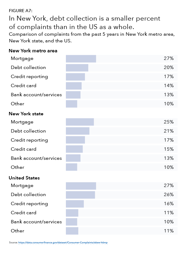
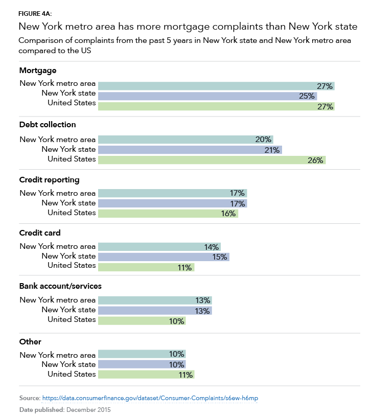
Examples

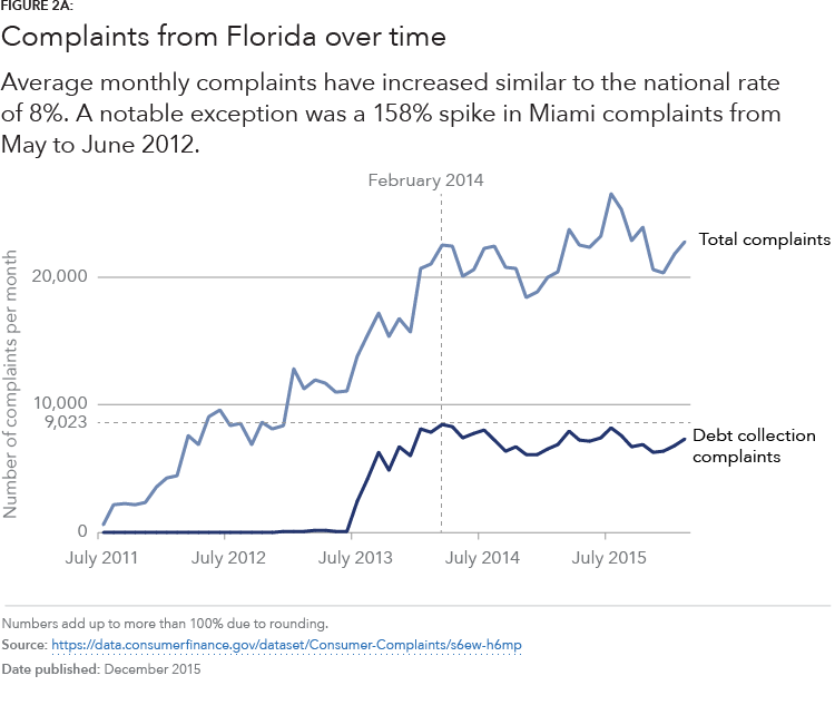
Line charts
Use when you have one factor over time to show change. Start your axis at 0 and label your axis to avoid confusion.
Key points
- Label your lines directly or use different patterns for each line.
- Generally show five or fewer lines to avoid confusion.
- Consider using many small line charts if you need to show more factors. (These are called small multiples charts.)
Examples
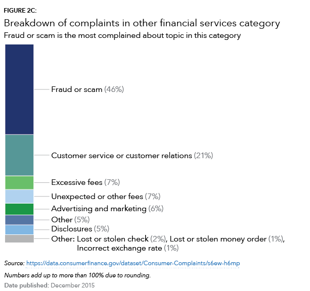
Pie or doughnut charts
Use when you have less than six things that add up to 100%. Use the middle of the doughnut to highlight the number or category type. You could also consider using a stacked bar chart instead.
Key points
- The slices should add up to 100%.
- Use 5 or less slices.
- Directly label all slices.
- Use a white outline or stroke to create contrast between the slices.
Examples