Color
When used properly, color can help clarify relationships between data, provide emphasis for certain data points, and maintain a consistent brand voice. When used poorly, color can overwhelm the user, make the data confusing and break with brand standards to appear inconsistent.
Key questions
- Does the use of color have a purpose?
- Have you relied on more than just color to connote meaning?
- Have you accounted for color blindness?
Color schemes
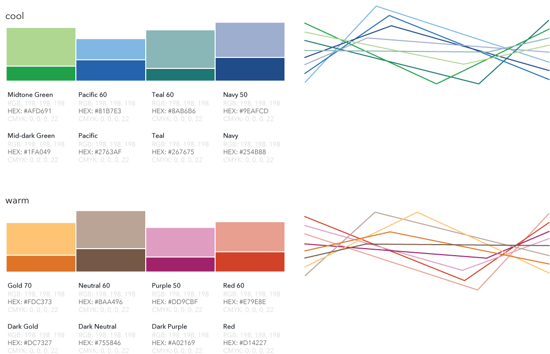
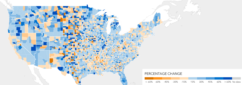
The following sets of colors maintain CFPB brand cohesion and create accessible graphics.
Subsets and relationships
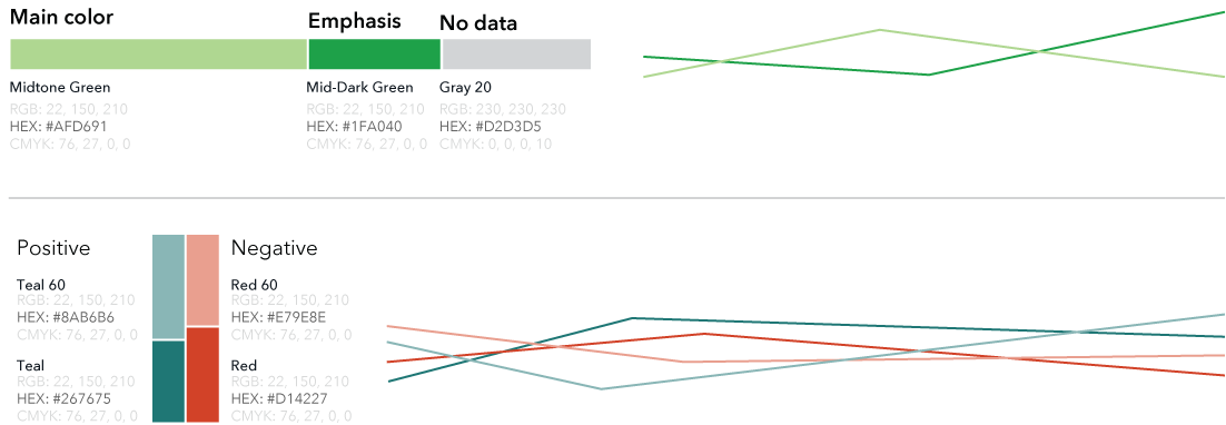
To highlight part of a set of data, or show that things are related, use a tint or a shade of the main color.
Examples
Categorical
Use categorical color schemes when you’re visualizing groups of things. These are discrete colors that do not imply an visual relationship between the sets of data.
Examples
Sequential
When you’re displaying sequential data that shows a range of data in a ranked order, use these sequential colors to imply the relationship.
Examples
Color accessibility
Color should never be solely relied on to convey meaning in a visualization because of accessibility standards for people who are blind and visually impaired. There should be other clues beyond color to convey meaning or relationship; this is a key reason that also directly labeling data and using patterns is important.
You can use the Color Palette Accessibility Checker to check and confirm the accessibility of CFPB colors at different type sizes.
Color blindness
When choosing colors for a graph, keep in mind that they may look different to people with color blindness. About 1 in 12 men with Northern European ancestry have green/red color blindness.
Instead of green/red, the teal/red color combination should used instead for pro/con, yes/no, positive/negative relationships. This both improves accessibility associated with color blindness, and also leaves the CFPB green color to represent the brand.
Examples
This is an example of a visualization using the green/red combination, and how it can appear to someone with red/green color blindness:


This is an example of a visualization using the teal/red combination, and how it can appear to someone with red/green color blindness: