Emphasis!
Highlighting parts of your chart will help users quickly understand the point of the graphic and accurately comprehend the information.
Key questions
- What is the point of the chart?
- Can someone who hasn’t seen the chart before figure out the point from a quick look and the title?
Visual hierarchy
Good visual hierarchy allows the user to focus on the most important piece of content first and work their way into the graphic. The title and subtitle should be the first thing that the user reads when viewing the chart to give them context of what the chart is about. Therefore, they should be the biggest thing on the chart (see the Data visualization chart components section).
Use the squint test (take a step back from your graph, squint your eyes, and say what you see first, second, third…) to get a sense of what your users will automatically identify first.
Labels
Goals, trends, and important outliers should be highlighted to help the user discern what is going on with the data. Labels will help the user understand the data and make sense of what it is showing.
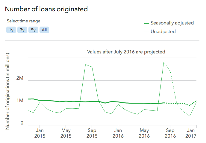
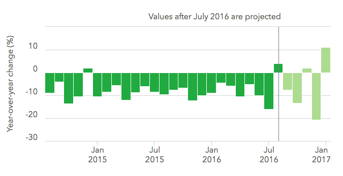
Projected values
When dealing with projected or predicted data, the predicted data should be deemphasized. Use a color change to a lighter tint or dashed outline for bar charts, a dotted line for line charts, and a label explaining what part of the data is predicted or projected.
Examples