Contact info
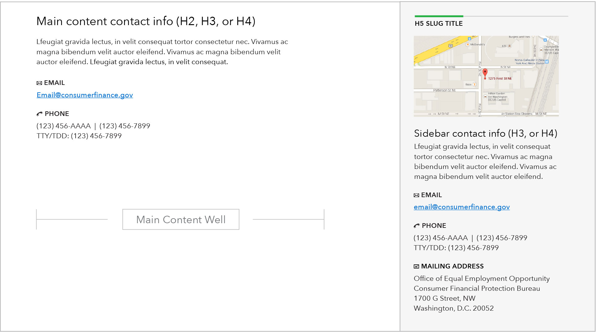
The contact information component is used to display phone, email, mailing address, and fax information for offices within the Bureau. This pattern may show up in either the main content area or the sidebar, as seen in the mockup below:
Use case
When to use
- When there is a specific action users may want or need to take that requires contacting a specific office within the Bureau.
- Default placement should be in the sidebar, use main content area when contact information is of extra significance or directly ties into the main objective of the page.
When something else is better
- When no contact information is needed or no specific action is tied to the contact information.
Behavior
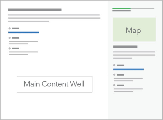
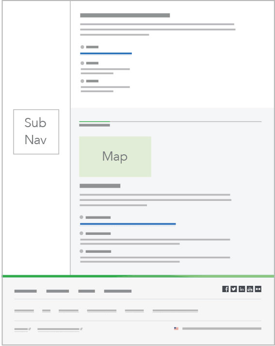
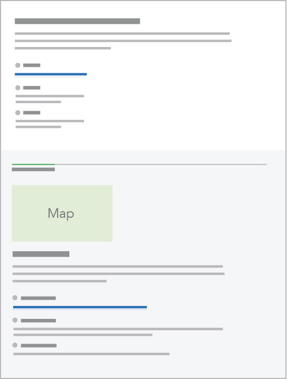
The mockups below show simultaneously how this pattern works within either the main content area or the sidebar:
Breakpoints 901+
As seen on pages with right sidebar.
Breakpoints 901+
As seen on pages with a sub nav.
Breakpoints 900 and less
Patterns are stacked single column.
Content guidelines
Headings should be the official name of the office.
Description beneath heading should clearly state why a user would need to contact the office. This description should closely follow the office descriptions linked through the bureau structure page. About 2-3 sentences in length (150-300 characters).
Email address should always be formatted as @consumerfinance.gov, not @cfpb.gov. (Addresses are automatically redirected, no technical work is necessary to support this standard.)
Mailing address:
-
Street suffixes (street, place, avenue, etc.) should be spelled out.
-
Cardinal directions (NW, SW, NE, SE, N, E, S, W) should be title case with no periods, and come after a comma.
-
Washington, D.C. has a comma and periods in D.C.
Style
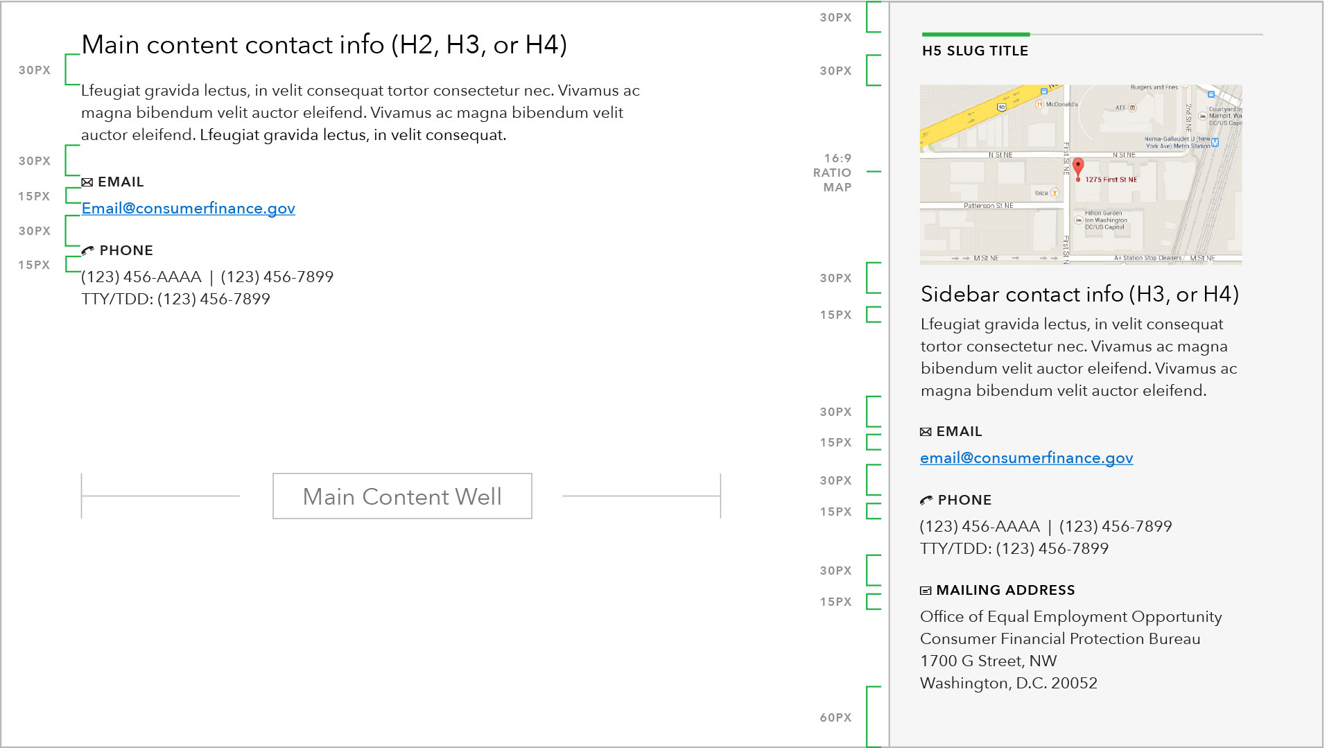
- Pre-set contact options are email, phone number (including TTY/TDD), fax, and physical addresses.
- Sidebar pattern includes the option for map imagery.
- Pre-set minicons are used to help visually reinforce the type of contact method.
