Sidebar/prefooter
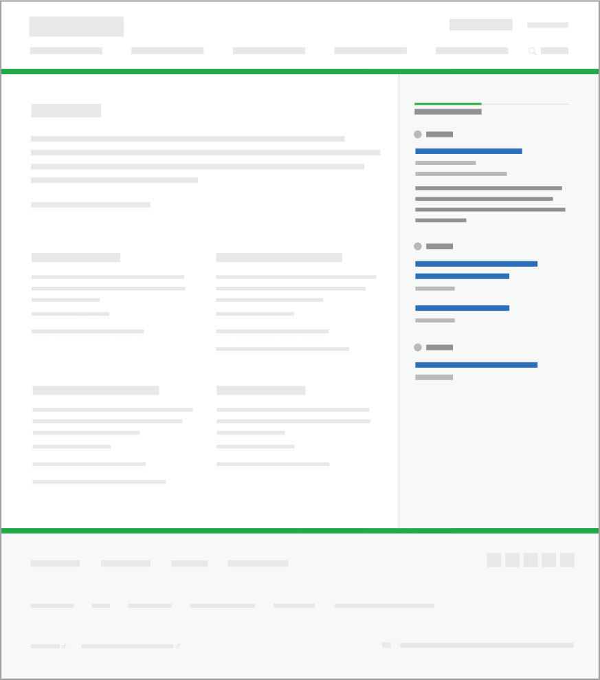
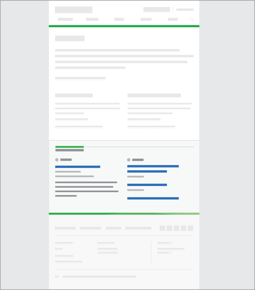
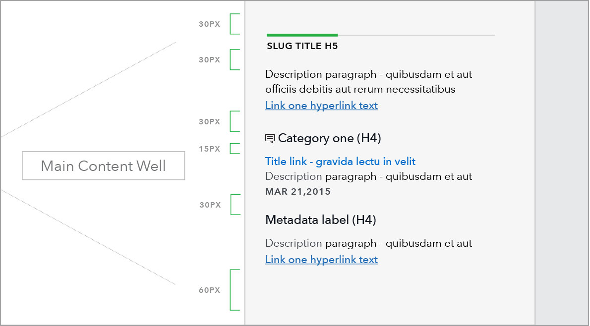
Sidebars are present across most page templates to house information related to the main content of the page. On pages with leftside sub-navigation, sidebar content may be displayed as an optional prefooter at the bottom of the main content.
Sidebars may can contain related posts, calls to action, metadata, email sign ups, contact information, etc. Primary layout variations as seen in basic sidebar format:
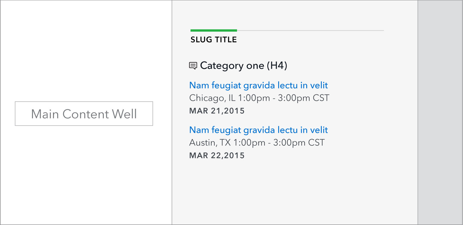
Related posts
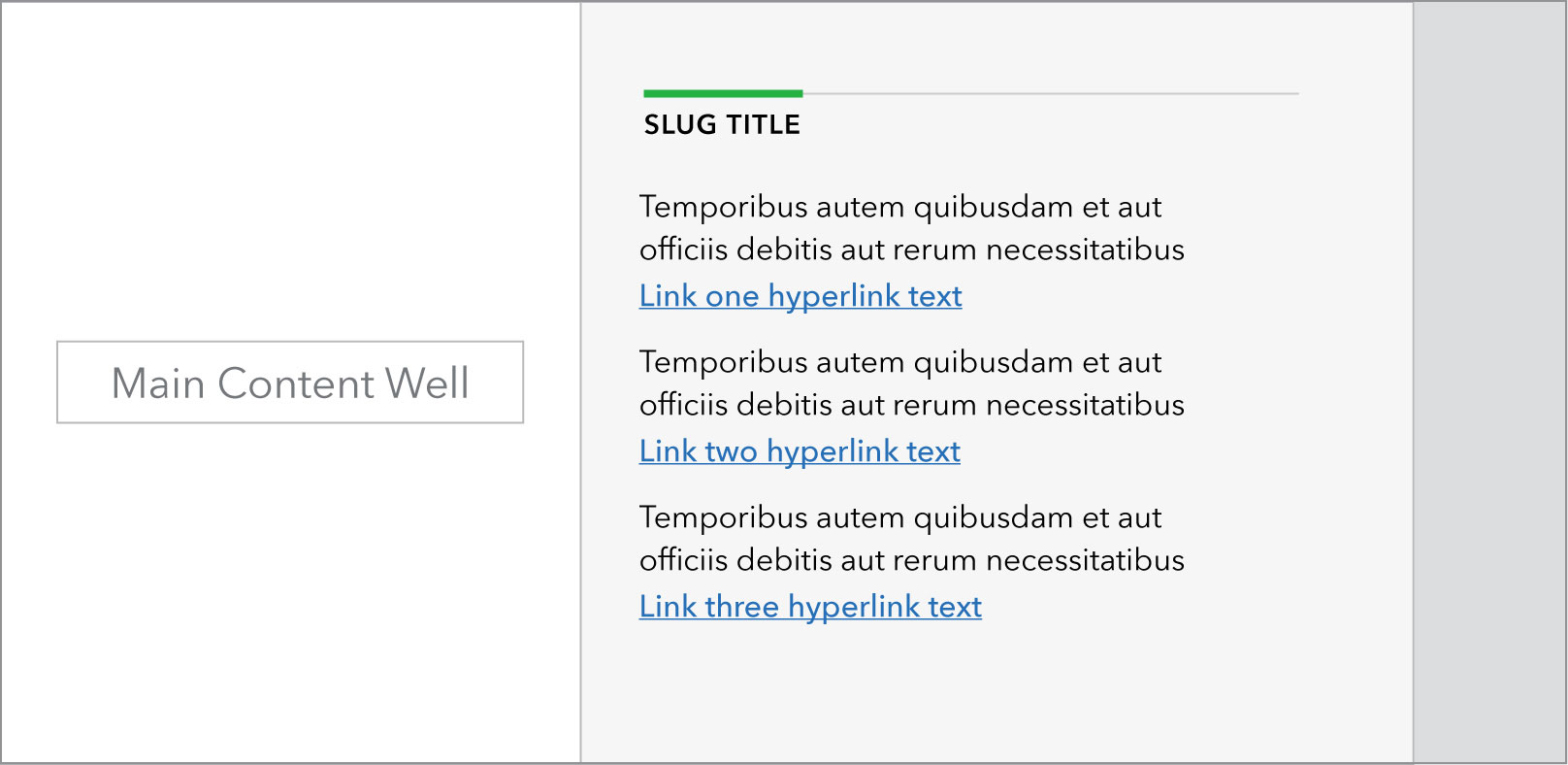
Related links
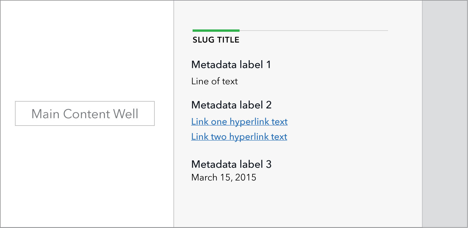
Metadata
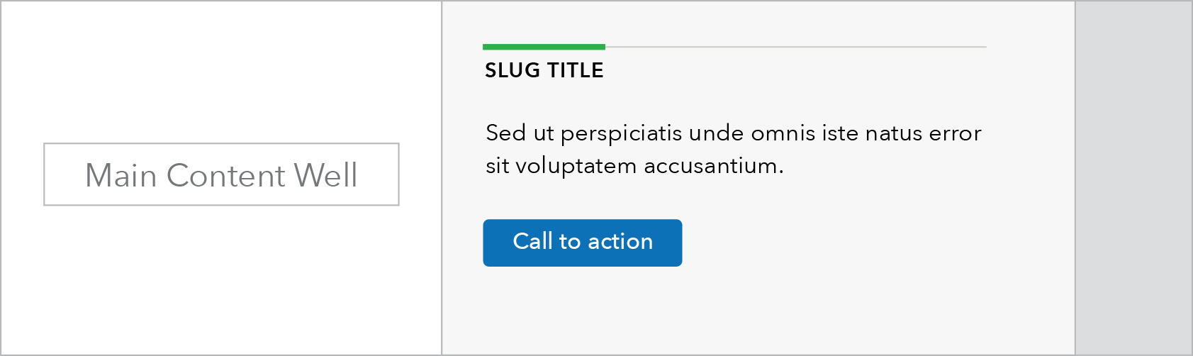
Call to action with button
Use case
Related posts
When to use
- This component is used to display lists of related content dynamically pulled from elsewhere in the site – blogs, events, and newsroom items– based on topic tag selections.
- The amount and types of related content may be restricted based on the subject matter and needs of the page.
When other options are better
- When lists of items should not be automatically updated consider related links instead.
- When posts will be mixed with other types of content.
Used on all templates
Related links
When to use
- When a specific, static piece of content and call to action needs to be displayed in the sidebar.
- When a static list of links or specific related posts need to be displayed in the sidebar.
When other options are better
- When all of the content is posts that can be dynamically populated.
Used on all templates
Metadata
When to use
- When displaying relevant metadata about a specific document or set of documents, such as for a rule, notice, or report, for users to easily reference.
When other options are better
- When anything other than metadata for a document detail page is being displayed.
Templates used on
Call to action with button
When to use
- When highlighting or featuring a call to take a specific action.
When other options are better
- When the “action” is navigating to another page of the site or downloading a document. Refer to the buttons page for more information.
Used on all templates
Behavior
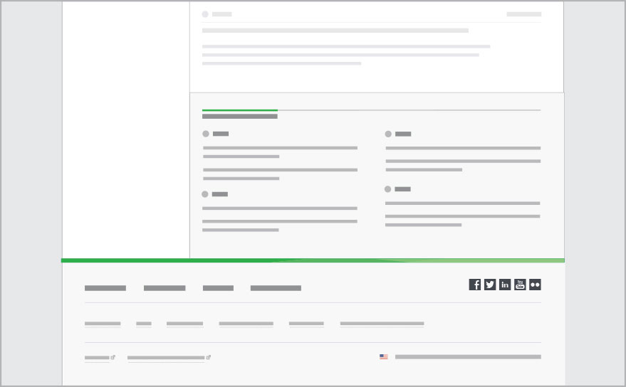
All variations of sidebar element move into prefooter format at screen widths less than 901 px. The sidebar area can house multiple stacked sidebar elements.
Sidebar 901+
Sidebar 900 or less (transition to prefooter)
Prefooter format is automatically used on pages that have a left side secondary navigation.
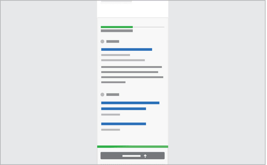
Below 601 px width, for legibility link styling on clickable headings remains in the standard format, but mobile link style is applied where possible.
Prefooter 901+ (with side nav.)
Prefooter 600 or less
Content guidelines
- Slugs should be as succinct as possible, ideally 30 characters or less. They should be limited to one line at max column width.
- Description beneath heading should also be succinct, limited to 3 lines at max column width max; 100 characters.
- Call to action link should be limited to one line at max column width; 40 characters or less.
Style
Global
- Background: 5% grey (#F7F7F7)
- Multiple elements can be used in the sidebar/ prefooter but each should have their own slug label.
- Under 600px all elements become single column. Mobile link style should be used in place of normal links at this size.
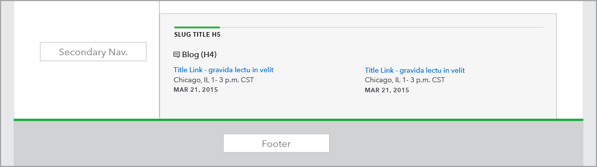
Prefooter
- Content can be one or two columns in prefooter depending on need.
- Content is populated in a Z-order, chronologically.