Browse page
Browse page types provide specific topic or product overviews and information. Often these pages contain medium-length content, access to specific documents or other resources, or descriptions of action steps.
Related browse pages within a specific section can be accessed via the left side sub-navigation so users can easily move around within the topic. Browse pages can have parent-child relationships to other browse pages.
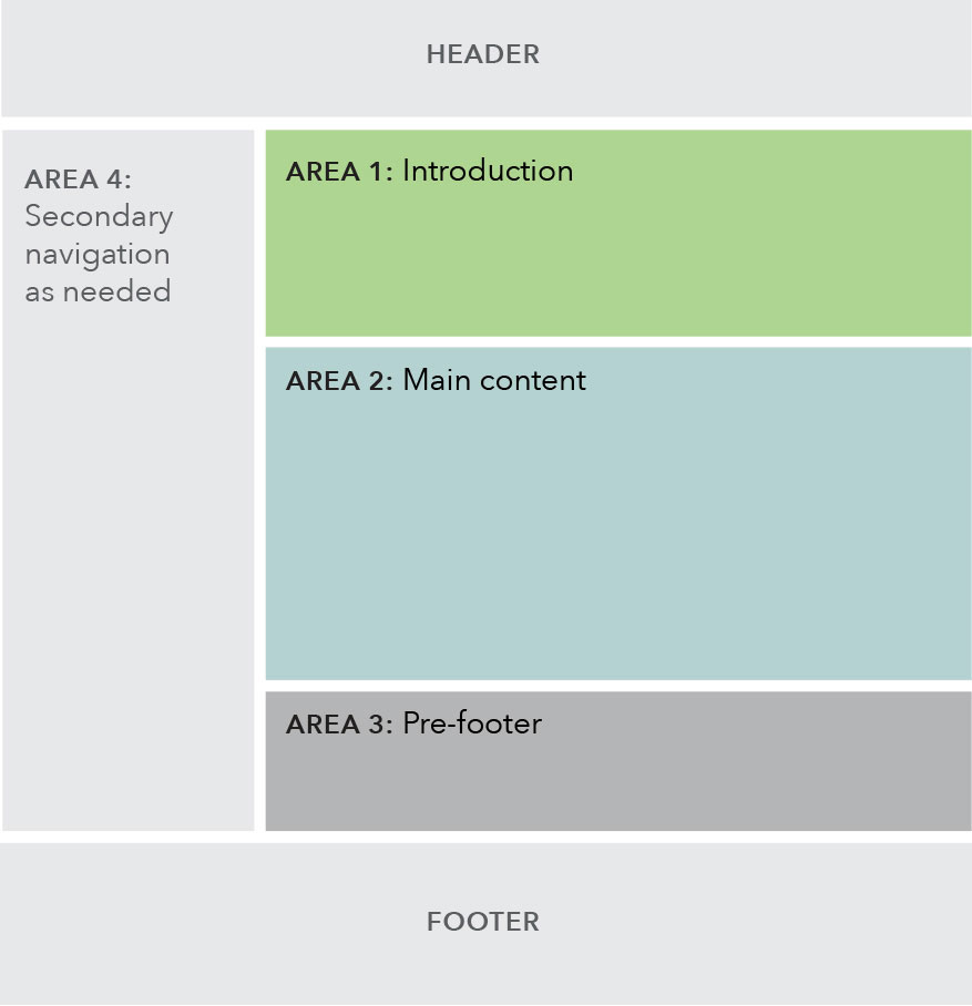
Each browse page template has four basic content areas:
Use case
When to use
- When adding new information to an existing topic area within one of the main navigation verticals.
- When introducing a sub-topic, describing action items, or listing out resources.
- Target user is primarily in a browse mindset, interested in quickly consuming information and keeping an eye out for key phrases, so content on this page should be grouped to help them quickly find relevant information.
When other options are better
- When page content is a lengthy article or text.
Page components included
Within each area of the template, various components may be selected to best fit the content of the specific page being created.
Area 1
Area 2
Area 3
Area 4
Automatically generated breadcrumb and left side sub-navigation
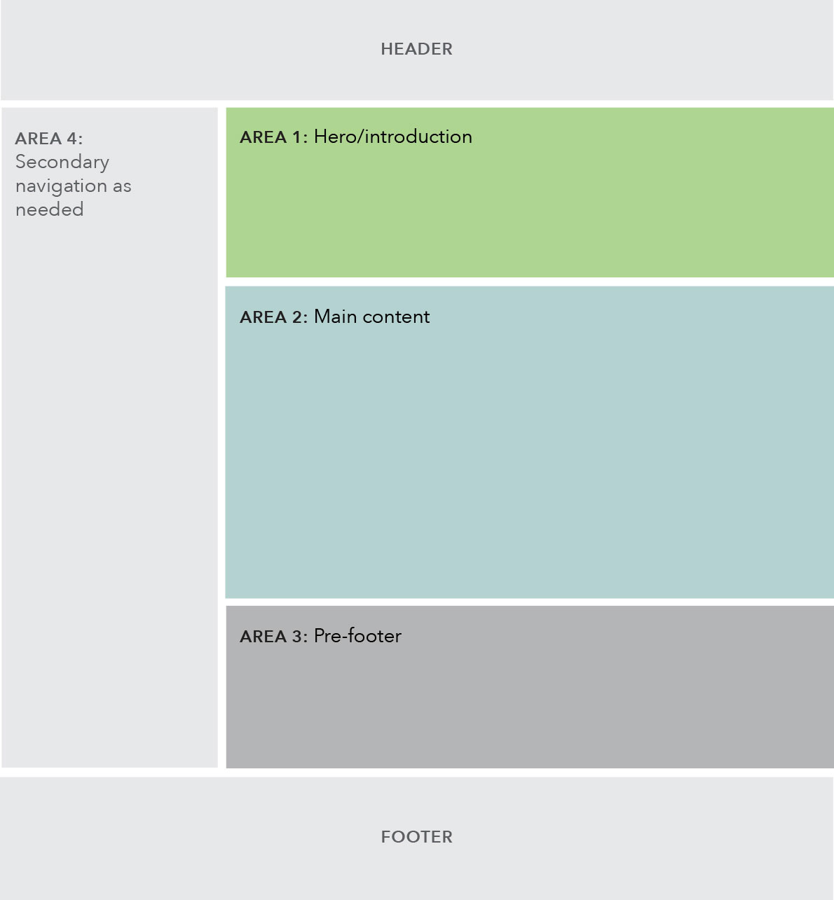
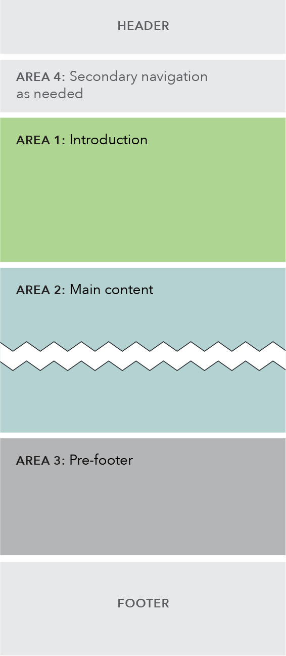
Behavior
Below the 901 px breakpoint, the sub-navigation collapses into the global navigation under a hamburger menu, as seen on the Regulatory agenda page. In cases where a browse page has children browse pages, the children will appear in a special expandable navigation at the top of the page, as seen on the Implementation and guidance page.
Breakpoints 901+
Breakpoints 900 and less
Content guidelines
Content should be displayed in a way that allows for ease of browsing; group content in ways that makes it easy to find.
Page titles are sentence case and use the word “and” instead of “&”. Left side sub-navigation and breadcrumb labels follow same style as the main menu.
Try to avoid creating superfluous paragraphs to contain url text; list urls where possible and minimize unnecessary content; this will help the user browse and find what they need faster, and helps to give visual clarity without the need to read the entire paragraph to find what they need.
Style
Area 1: Introduction
- Text introduction is required.
Area 2: Main content
- Must contain at least 1 component.
Area 3: Prefooter
- Optional.
- If using both static and dynamic content, preference for dynamic content to appear above static content.