Wells
Wells are used to highlight specific information within a designated section of a page. This breaks up the flow of content on the page and helps to emphasize and set apart the content that is included.
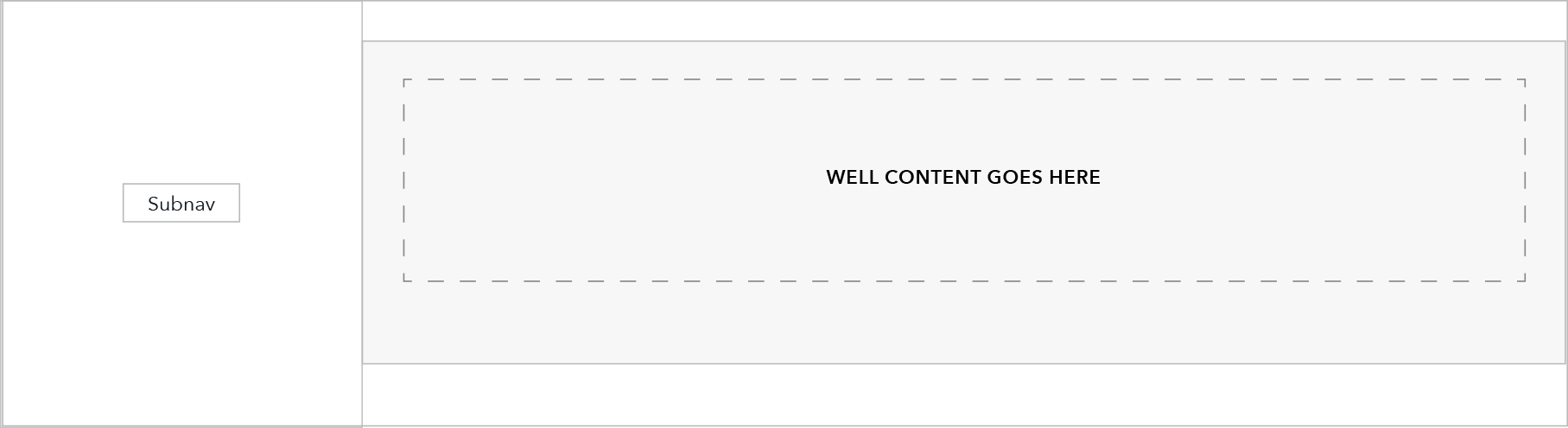
Layout as seen on a Browse page with left sub-navigation:
Use case
Use sparingly to attract users’ attention to a concise piece of content. Ideally, content within a well should not take up more than a third of page content.
Full width text, images, and embedded media (like video) may be placed within wells, however, if content includes imagery also consider the featured content module.
Behavior
Breakpoints 901+
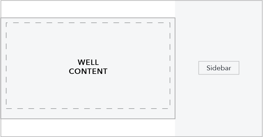
Page with a right sidebar
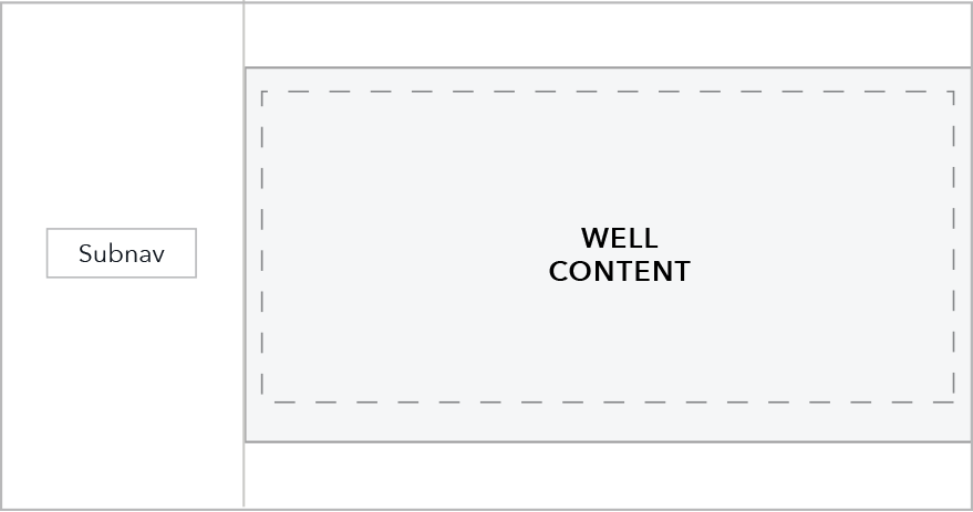
Browse page with left nav
Breakpoints 900 and under
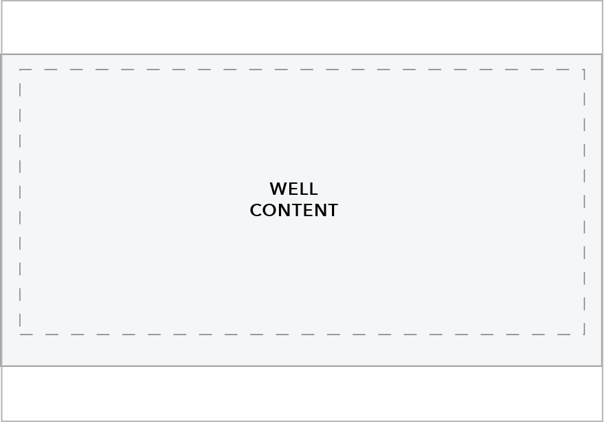
Wells are full width. At breakpoints 600 and under there are slight padding adjustments to maximize real estate on smaller displays.
Content guidelines
- Grey wells should be used to feature content or specific calls to action
- Grey well will help visually set apart the content within it, so use it to draw attention to that content.
- Grey wells should take up less than a third of a page.
Style
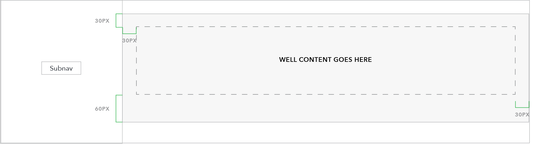
- Padding at breakpoints 601+: 30 (top), 30 (right) 60 (bottom), 30 (left)
- Padding at breakpoints 600 and below: 30 (top), 15 (right), 60 (bottom), 15 (left)
- Background color: 5% grey (#F7F7F7)
- Border: 1px 50% grey (#BABBBD)
- Currently, single column content only.