Featured content modules
Featured content modules (FCMs) function to highlight a specific piece of content within a page. They are not integral to the page, and could be removed while leaving the page integrity intact.
Repository
-
cf-layout
FCMs in Capital Framework
Use
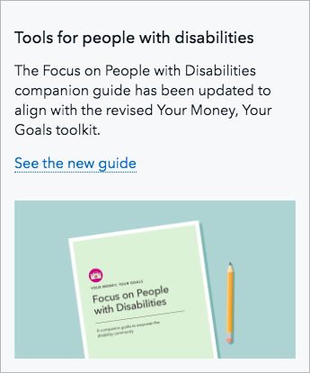
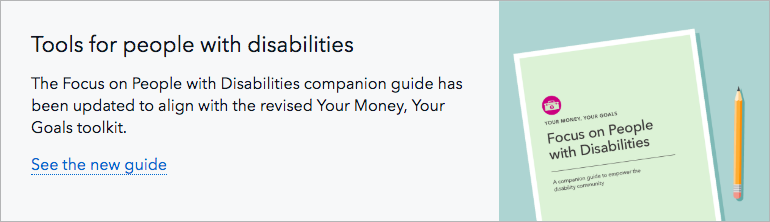
Featured content modules should highlight a single piece of content. That content can be almost anything, from a webpage to a blog post to a PDF to a video.
FCMs appear below the title and introductory paragraph on a page, and retain that position on all screen sizes.
FCMs contain a headline, body copy text, a call to action (either a text link or a play button), and a graphical element related to the piece of content being featured. They are a “mini story” and never simply a dominant visual.
FCMs can appear on any page type, though they are best suited for pages third level and below in the site map. They are designed to accommodate pages with either a left-hand navigation or right-hand sidebar.
Style at desktop and tablet sizes
- Module spans the full width of the page’s content area and is 220px tall at maximum page width. It appears 60px underneath the header/intro paragraph of the page.
- Background color of module is Gray 5 with a 1px Gray 40 stroke.
- Visual is always 270px wide and 220px tall at maximum page width.
- Text spans 5 columns at maximum page width and is left and top aligned. There is 30px of padding around all sides of the text.
- The ratio of text and visual changes with screen size to keep the full height of the image visible. As available width dips below the maximum page width, the text area shrinks in width while the visual maintains a fixed width of 270px. That means that the height and aspect ratio of the visual will change as the screen shrinks, and the image will be cropped between 16% and 29% from each side.
- Heading: H3, 35 maximum character count (including spaces)
- Body copy: 16px, appears 15px below the headline, 160 maximum character count (including spaces)
- Call to action link: 16px, standard link colors, appears 15px below body copy, 35 maximum character count (including spaces)
- Play button (for FCMs with a video): 60px diameter, Black background at 75% opacity that changes to Pacific on hover, White icon, 2px Gray 5 border, centered in the visual
Style at mobile size
Differences in style at mobile size:
- Text and visual are stacked instead of side by side with 30px space between text and top of visual
- Headline: H4
- Visual is always in a 16:9 ratio
- 15px of left, right, and bottom padding around all content in the FCM