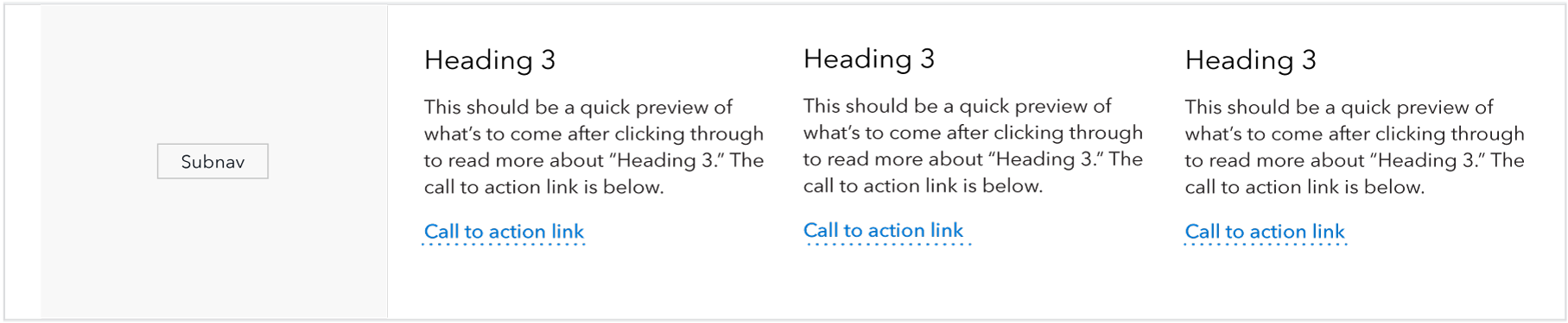
Third-width link blob
The third-width link blob provides users with supplemental content or suggested navigation paths to sibling pages. The three-column layout utilizes extra screen real estate found at higher breakpoints.
Use case
When to use
- Default option for providing users with secondary content or suggested navigation paths to sibling pages.
- Ideally, when a group of these components can be featured together in multiples of three (3, 6, 9, etc.).
When other options are better
- When the number of components would be better featured in multiples of 2 (Suggest using the half-width link blob)
- When headings are too long for the narrower width, for example, when they break to 3 lines or more.
- When content requires imagery (Suggest using the 50/50 image and text or the 25/75 image and text instead
- When there are multiple paragraphs of copy
- When the page includes a sidebar
Behavior
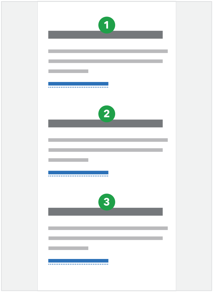
At breakpoints below 601, the three-column pattern transitions into a single column and stacks each instance in Z-order.
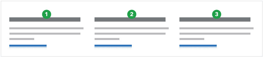
601px and above (3 column)
600px and below (1 column stacked)
Content guidelines
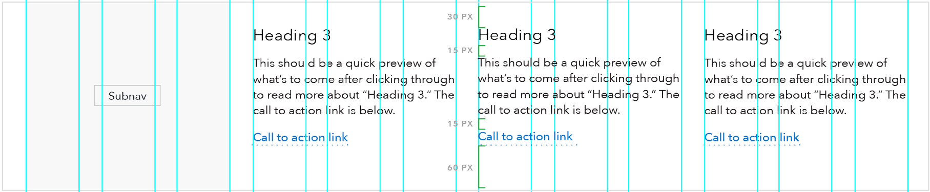
- Headings should be as succinct as possible, ideally 1 line at max column width (25 characters) or two lines at max column width maximum (45 characters).
- Description beneath heading should also be succinct, roughly 3-5 lines at max column width of text (between 90 and 150 characters).
- Call to action link should stay on a single line at max column width; 30 characters or less. Link content should follow link guidelines.
- When these components are featured together (which is ideal), the amount of content in each component should be as close to the same number of total lines as possible; a difference of one line is ok, but the components look best as a grouping when they are the same height (have the same number of lines).
Style
- Headings: Use H3 or H4. Do not use both.
- H3: Use when you wish to give the blob heading text a higher level of prominence within the page hierarchy. Avoid using H3 when it will cause the heading to break to 3 lines or more.
- H4: Use when you wish to give the heading text less prominence within the page hierarchy or when the blob set follows an H3 heading. When you select the H4 you have the option of including a minicon to the left of the heading.
- Body copy: Avenir paragraph.
- At breakpoints below 601: H3 automatically drops down to an H4, the three-column pattern transitions into a single column and stacks, and the mobile link style is used for the call to action link(s)