50/50 image and text
The 50/50 image and text component is used to call attention to specific linked content on a page and feature it prodominantly. At larger breakpoints, this component has a two column layout to utilize extra screen real estate.
The half-width link blob component is a variation of the 50/50 image and text that does not use imagery.
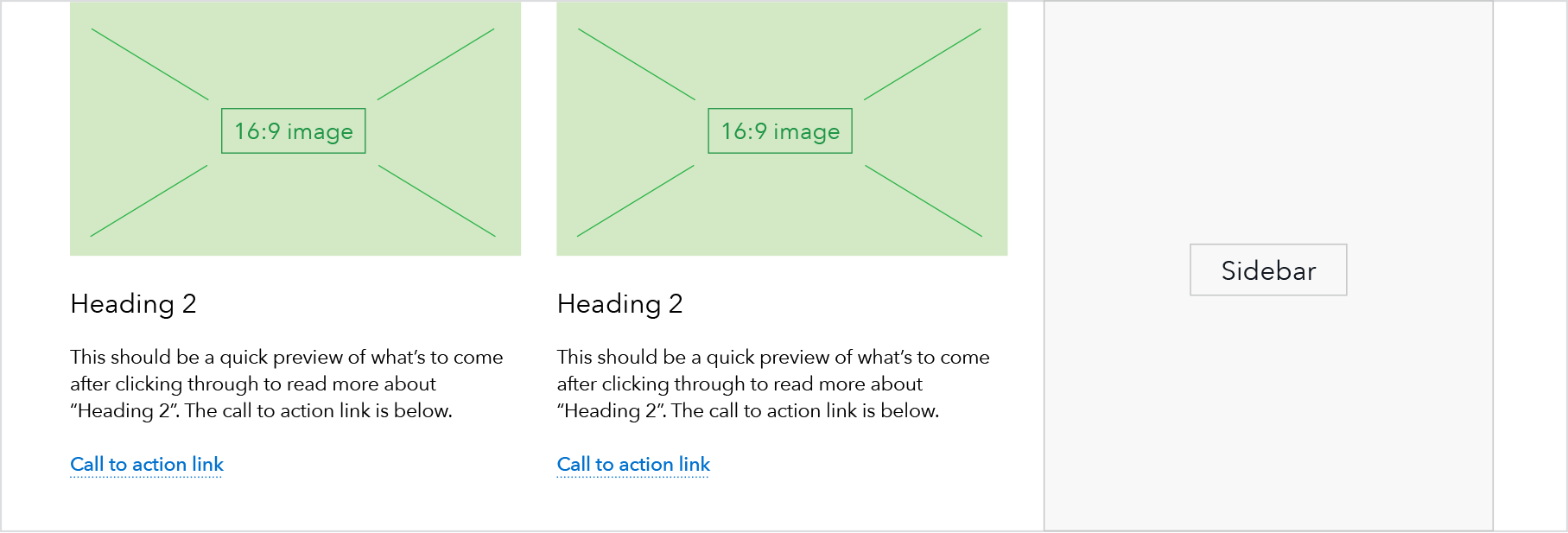
A pair of 50/50 image and text components, as seen on a landing page template:
Use case
When to use
- When a call-to-action, leading users to a deeper page in the section, needs a visual highlight on the page.
- When an image or illustration helps users better understand the purpose of content.
- Ideally, when an even number of these components can be featured together.
- To help establish a hierarchy of linked content on this page.
When other options are better
- When content doesn’t require imagery. Suggest using the half-width link blob component instead.
- When there are multiple paragraphs of copy.
Behavior
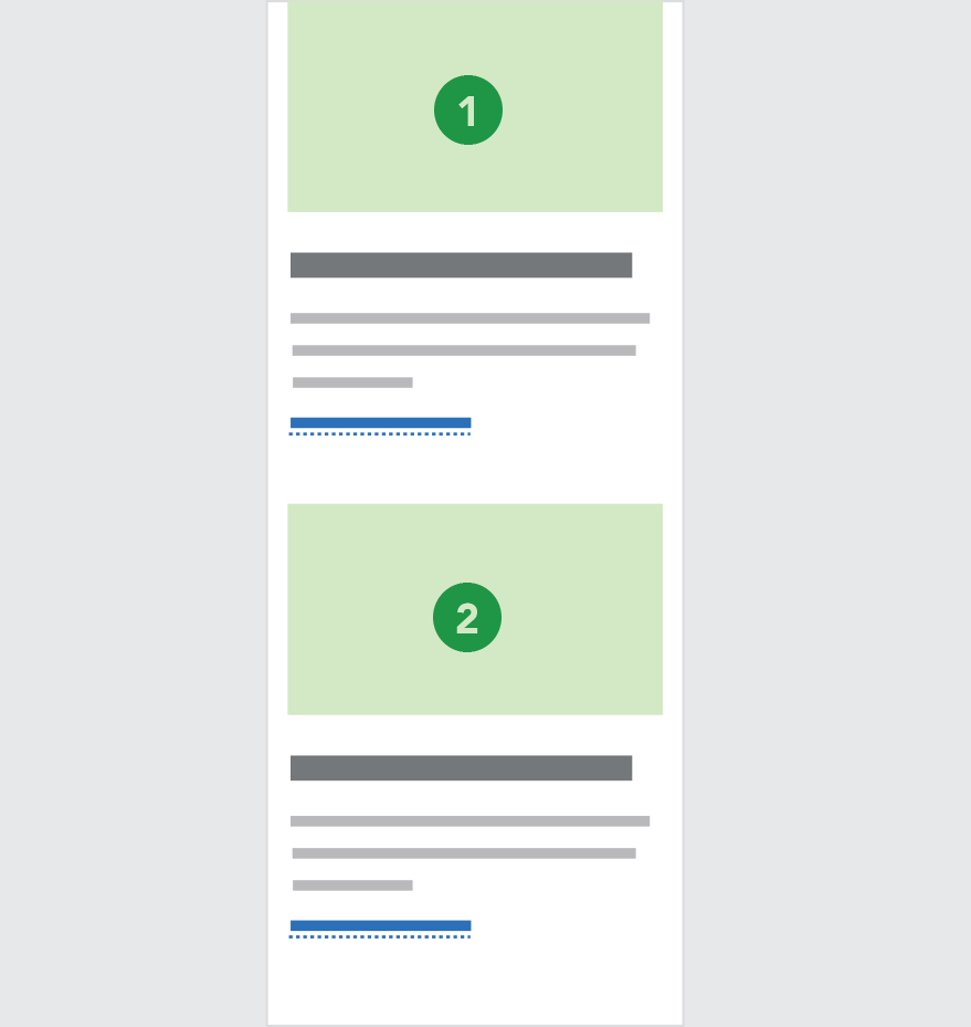
At breakpoints below 601, the two-column pattern transitions into a single column and stacks each instance in Z-order.
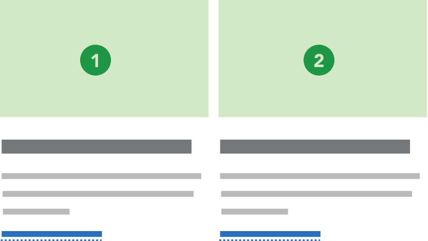
Breakpoints 601+ (2 column)
Breakpoints 600 and less (1 column stacked)
Content guidelines
- Headings should be as succinct as possible, ideally staying on a single line at max column width (30 characters or less).
- Description beneath heading should also be succinct, 2-3 lines at max column width of text; roughly 50-130 characters.
- Call to action link should be one line; about 40 characters or less. Link content should follow link guidelines.
Style
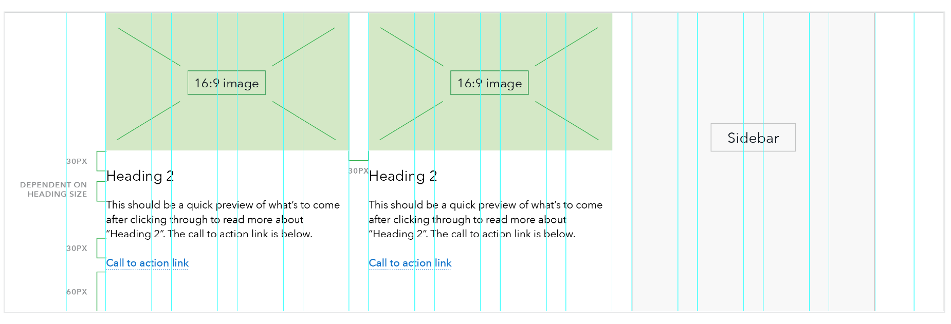
- Imagery: 16:9 ratio, recommend 1600 x 900 pixels to account for retina displays.
- Headings: Any heading size may be used, recommend H2-4.
- Body copy: Avenir paragraph.
- At breakpoints below 601: Heading sizes H3 and above automatically drop down one level and the mobile link style is used for the call to action link(s).