25/75 Image and text component
The 25/75 image and text component is used to draw the user’s eye to key information and navigation links, and aid comprehension by pairing content with illustration/imagery.
When used in conjunction with half width link blob, it can help create a hierarchy of child pages or other content on the page, or can help feature a particular link over others.
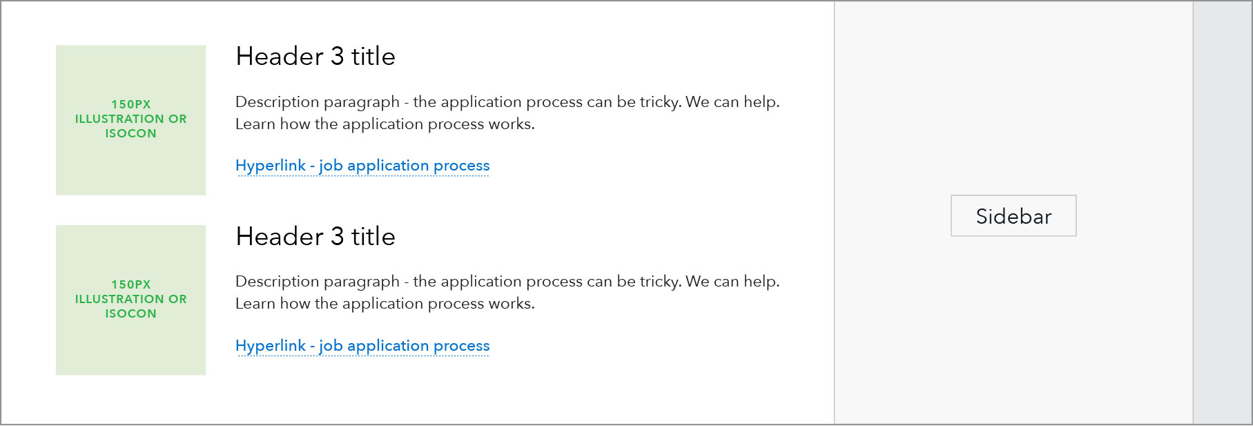
Layout as seen on a Landing page template:
Use case
When to use
- When a call-to-action, leading users to a deeper page in the section, needs a visual highlight on the page.
- When an image or illustration helps users better understand the purpose of content.
- Can be used for an even or odd number of items and may imply a hierarchy of information given the list style format.
When other options are better
- When content doesn’t require imagery. Suggest using the half width link blob pattern instead.
- When there are multiple paragraphs of copy
Behavior
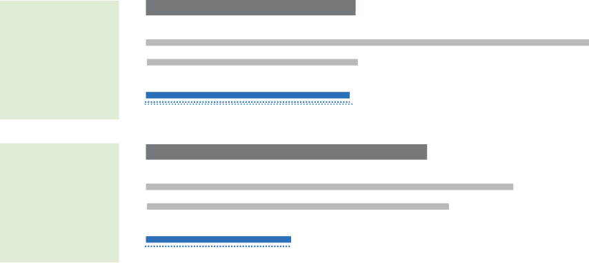
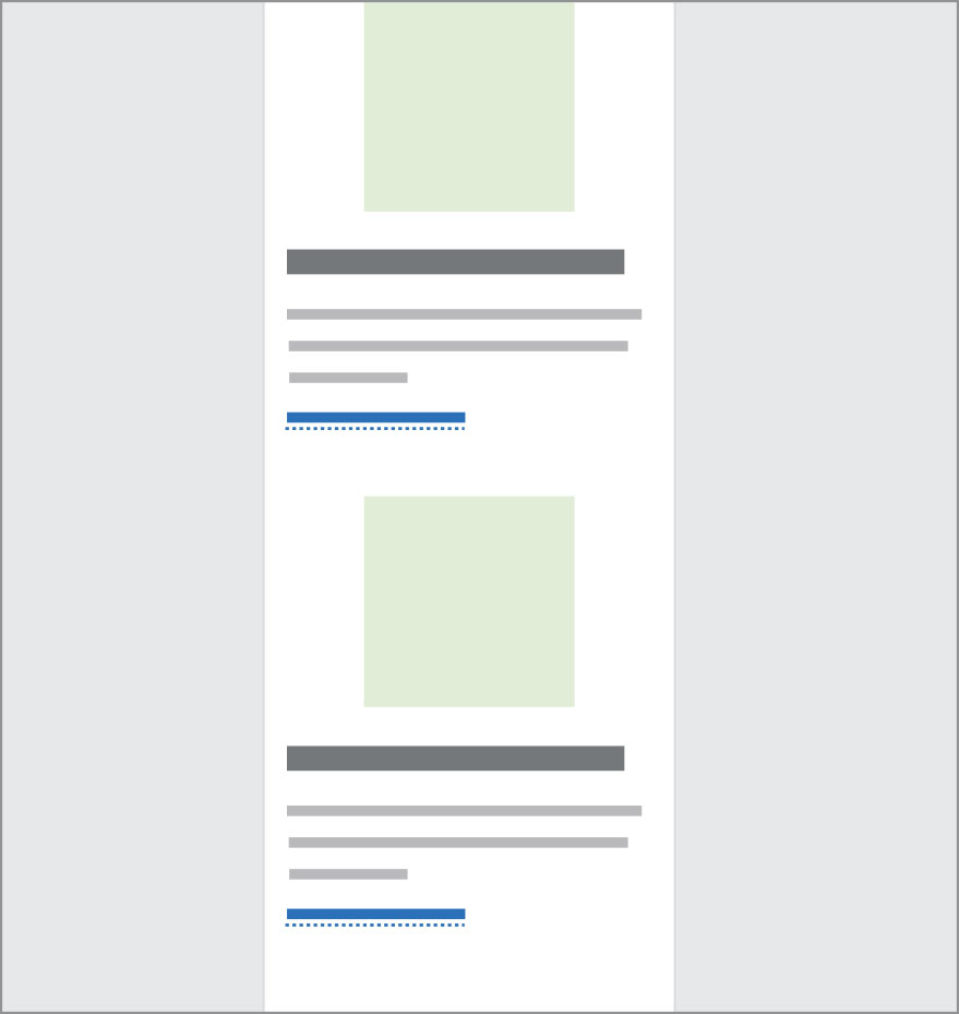
At breakpoints below 601, the two-column pattern transitions into a single column and stacks each instance in Z-order.
Breakpoints 601+
Breakpoint 600 and less
Content guidelines
- Headings should be as succinct as possible, ideally staying on a single line at max column width; 60 characters or less.
- Description beneath heading should also be succinct, ideally no more than 4 lines at max column width; 1-2 sentences, no more than 275 characters.
- Call to action link should be a single concise phrase starting with an action verb. Should stay on a single line at max column width; 65 characters or less.
Style
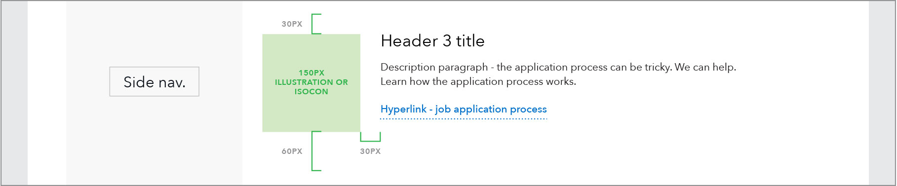
- Imagery: 1:1 ratio, may be illustration, isocon, or photography. 150px wide for 901+ px breakpoint and 130 px wide for 900 px breakpoint and below
- Padding: 30px padding for imagery across responsive sizes
- Headings: Any heading size may be used, recommend H2-6