Fonts
A clear typographic hierarchy is critical to the effective communication of our brand. Type should be light and well-spaced to reinforce that we are transparent, open, and approachable. This system uses weight, scale, and capitalization to convey the relative importance of each heading within a document. Readability, accessibility, and font smoothing to allow all users to efficiently read and absorb textual information.
Typefaces
In July 2025, we updated our typeface from Avenir Next to Source Sans 3, a typeface included in the U.S. Web Design System. With letters that are slender but open, Source Sans 3 has a simple and approachable look.
Source Sans 3 Semi Bold
ABCDEFGHIJKLMNOPQRSTUVWXYZ
abcdefghijklmnopqrstuvwxyz
0123456789
HTML code snippet
<h3 style="font-weight: 600;letter-spacing: 1px;">Source Sans 3 Semi Bold</h3>

<h4 style="font-weight: 600;letter-spacing: 1px;">ABCDEFGHIJKLMNOPQRSTUVWXYZ<br>
abcdefghijklmnopqrstuvwxyz<br>
0123456789</h4>
Source Sans 3 Medium
ABCDEFGHIJKLMNOPQRSTUVWXYZ
abcdefghijklmnopqrstuvwxyz
0123456789
HTML code snippet
<h3 style="font-weight: 500;">Source Sans 3 Medium</h3>

<h4>
ABCDEFGHIJKLMNOPQRSTUVWXYZ<br>
abcdefghijklmnopqrstuvwxyz<br>
0123456789</h4>
Source Sans 3 Regular
ABCDEFGHIJKLMNOPQRSTUVWXYZ
abcdefghijklmnopqrstuvwxyz
0123456789
HTML code snippet
<h3>Source Sans 3 Regular</h3>

<h4 style="font-weight: 400;">
ABCDEFGHIJKLMNOPQRSTUVWXYZ<br>
abcdefghijklmnopqrstuvwxyz<br>
0123456789</h4>
Guidelines
Readable text allows users to efficiently read and take in textual information. Text that is not readable turns off readers or makes it challenging for them to stay focused. The following guidelines promote good readability.
Normalization
As the U.S. Web Design System states, typefaces vary in optical size. Source Sans 3 is more condensed and has a smaller optical appearance than our previous typeface, Avenir Next. To address this difference and ensure our site’s components and readability remain intact, we adjusted Source Sans 3’s x-height to be optically closer to Avenir Next’s x-height. To accomplish this, we used a font-size-adjust CSS property.
Alignment
Typography should be set flush left. This provides the eye a constant starting point for each line, making text easier to read.
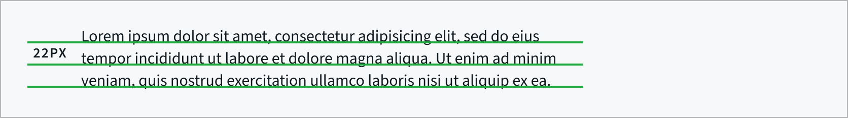
Line height
Ample space between lines of type promotes an open feeling and lends flow to body copy. When setting body copy, the leading should be 1.375 times the type size, or 37.5% larger.
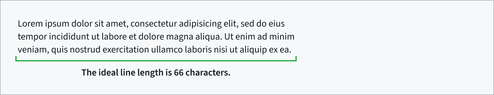
Line length
Comfortable line length allows the reader’s eyes to flow easily from the end of one line to the beginning of the next. The ideal line length is 66 characters, including spaces, though lengths may range from 45 to 90 characters.
In digital materials, readers are afforded some level of control over line length by narrowing their browser window or changing the type size display on their devices. In printed materials, readers do not have this control. For this reason, special effort should be made to use a line length as close as possible to 66 characters in printed materials. This can be achieved by using a multi-column layout or larger margins.
Spacing
White space affects how the user focuses their attention on the content. It makes it easier to know what to read and where to begin. Spacing between typographic elements should be open enough to feel light, but close enough to establish a proper relationship between elements.
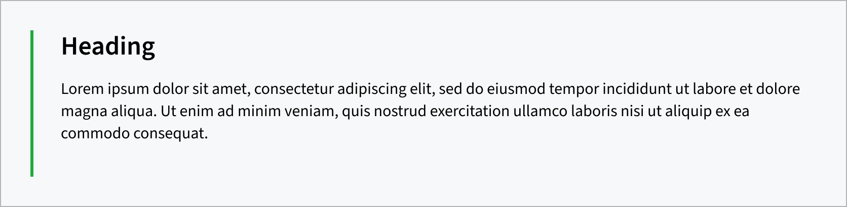
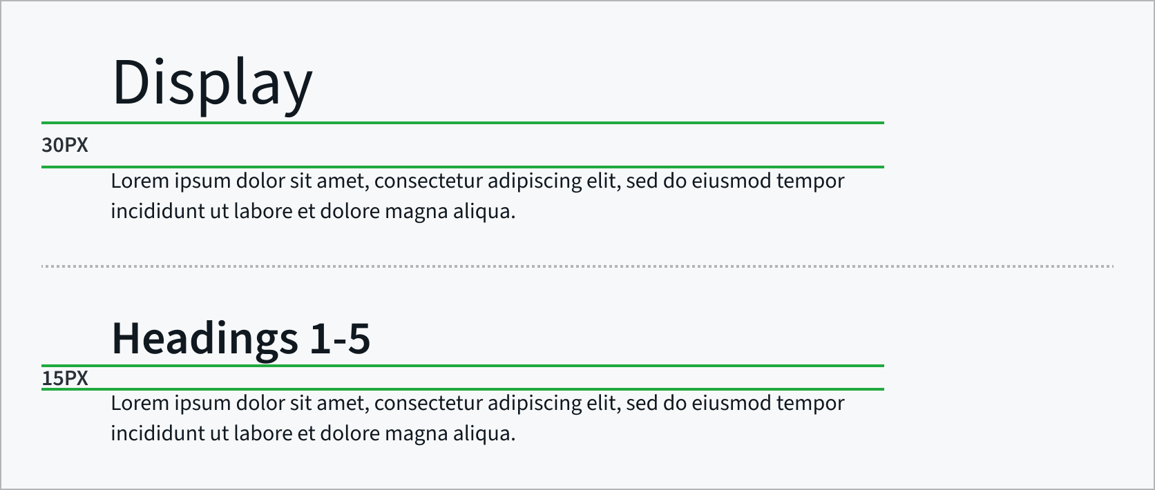
Heading followed by body copy
When a heading is followed by paragraph text, include 30px of space below Display and 15px below Headings 1–6.
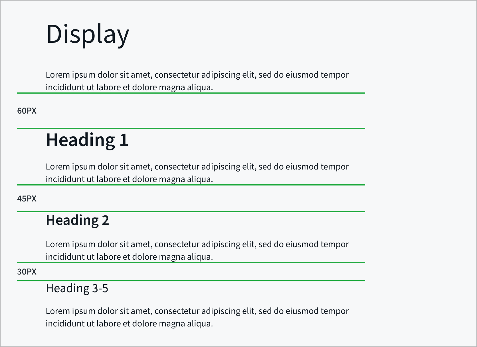
Body copy followed by a heading
When body copy is followed by a heading, include 45px of space above Heading 2 and 30px above Headings 3–6.
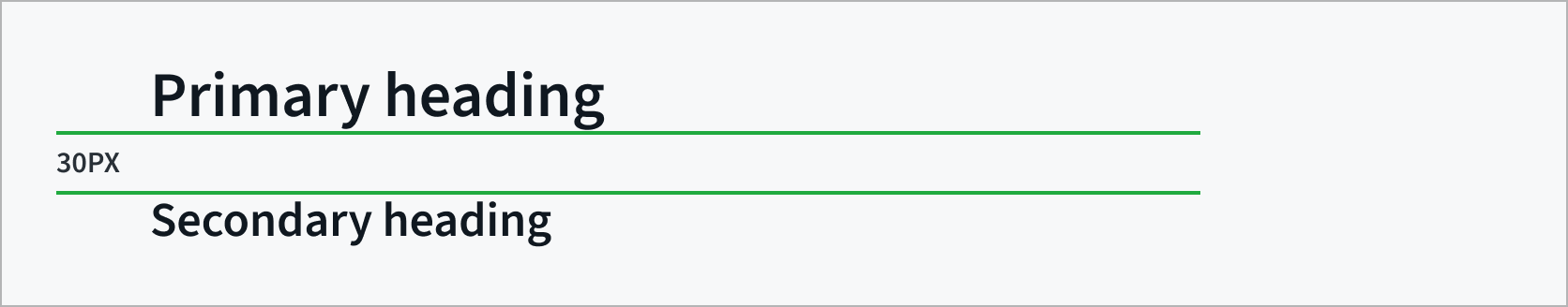
Heading followed by a heading
For stacked headings, include 30 px of space after the primary heading.
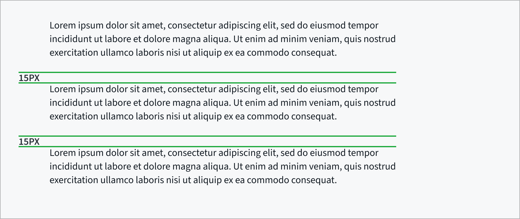
Body copy spacing
For multiple paragraphs within the same section set the space between paragraphs to 15px.
Accessibility
Web Content Accessibility (WCAG) standards ensure that content is accessible by everyone, regardless of any disability or user device. To learn more, refer to the http://www.section508.gov.
Don’t use type in illustrations or graphics
Type should generally not be used within an illustration or other graphic, as assistive technology such as screen readers can’t make sense of the words.
Colored type is restricted
Never use colored type, unless it’s a link. This restriction includes all brand colors, including CFPB green.
Although accessible, the combinations of black type on green or green type on black should never be used.
Accessible and brand compliant combinations
To ensure text remains compliant with WCAG 2.0 standards, use only these permitted type and background color combinations, which fall within the range of foreground/background color contrast permitted by the Section 508 guidelines. For specific color values, visit our Color page.
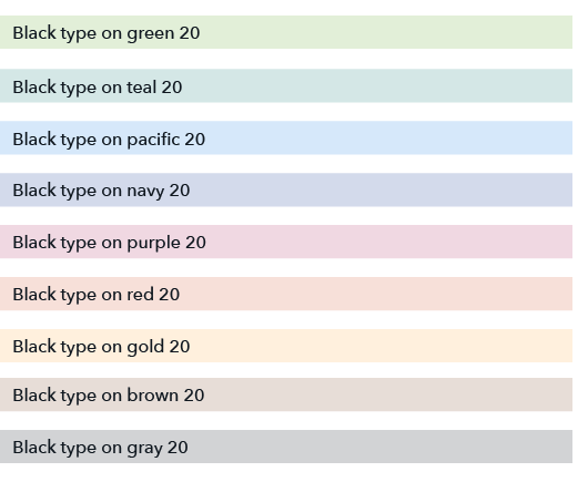
Black type on colored backgrounds
Black type is accessible on all brand colors with 20% saturation or below when using at least 14pt type. Visit our Color page for hex and RGB values.
A few colors allow for slightly darker saturations while still maintaining accessibility. If you’re looking to use a combination not listed here, check WebAIM Contrast Checker to verify accessibility.
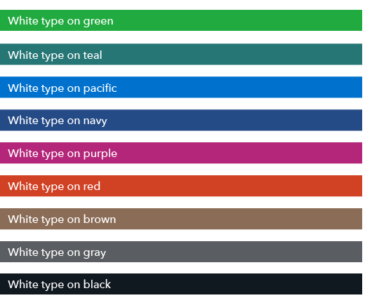
White type on colored backgrounds
White type is accessible on CFPB brand colors at 100% saturation and their darker shades when using at least 14pt type, with the following two exceptions:
- White type is accessible on CFPB green at 100% saturation and its darker shades only when using at least 14pt bold type. Alternatively, use at least 18pt regular type.
- White type is not accessible on any CFPB shade of gold.
The graphic below shows accessible combinations of white type on CFPB brand colors at 100% saturation. Visit our Color page for hex and RGB values.